Referral page redesign
This project spans two phases: an initial UI redesign in 2021, followed by a more strategic redesign and feature improvements in 2025.
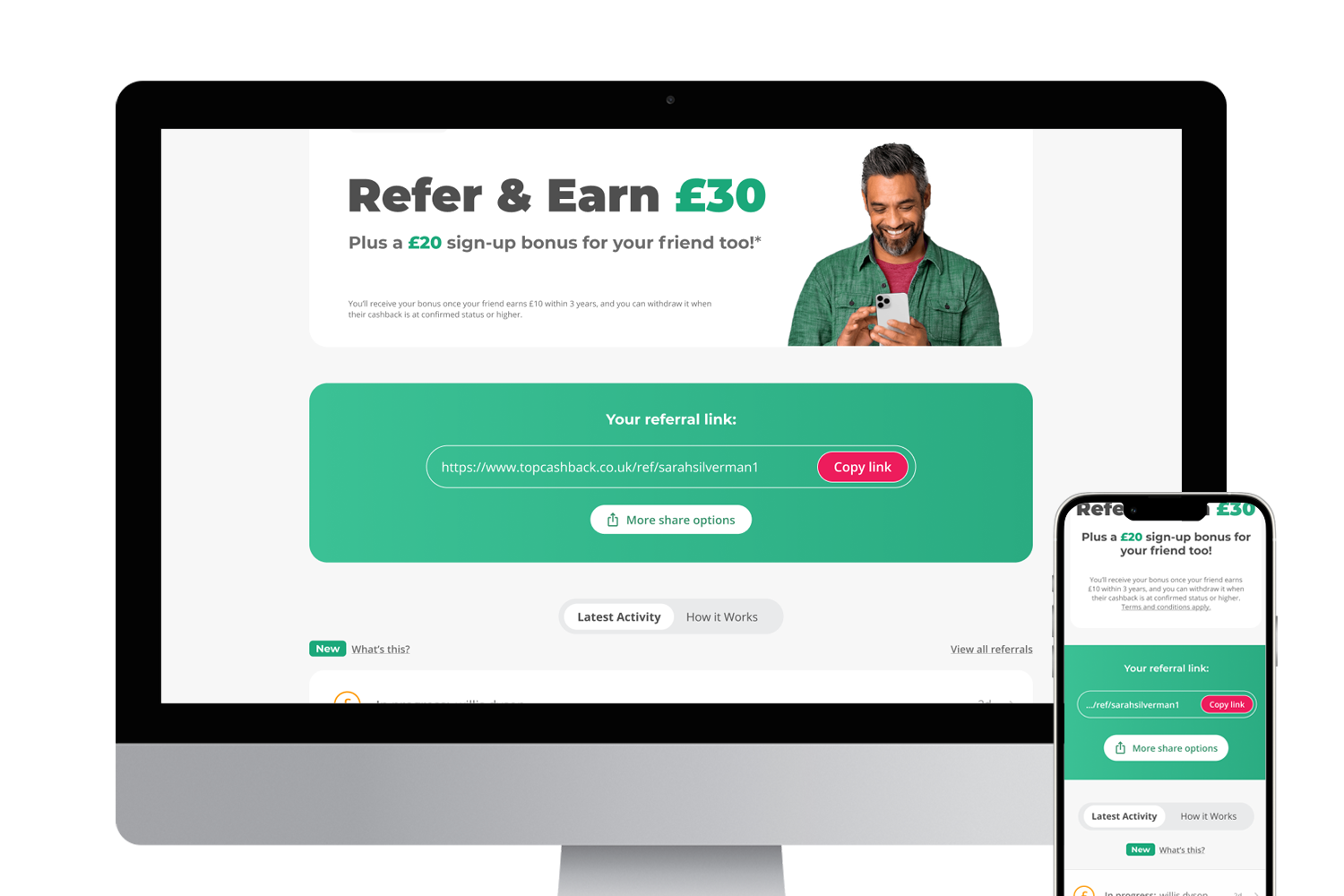
My first project was to redesign the referral page (Tell-a-Friend), which had not been updated in several years. The interface was outdated, and several elements were unclear or no longer aligned with user behaviour.
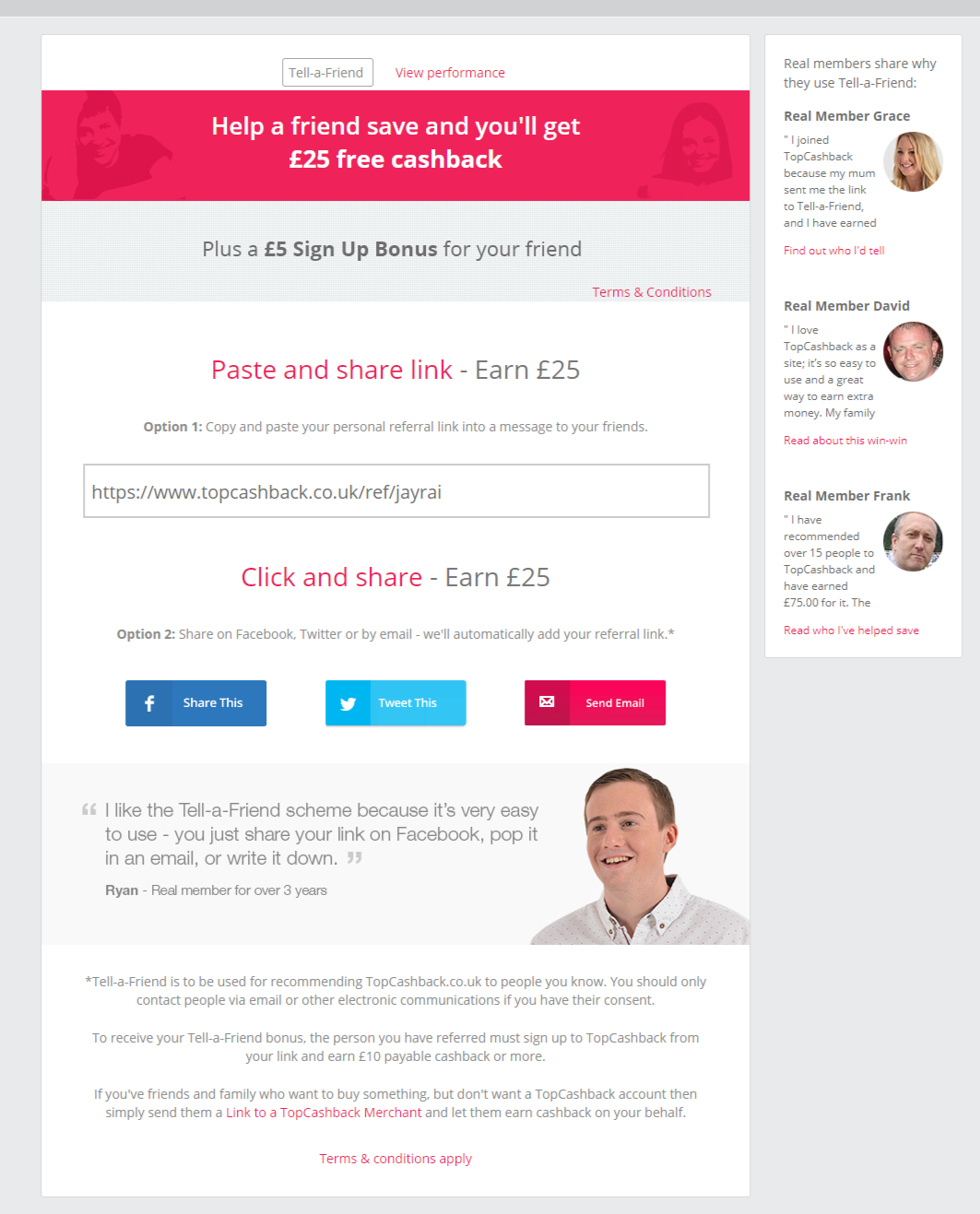
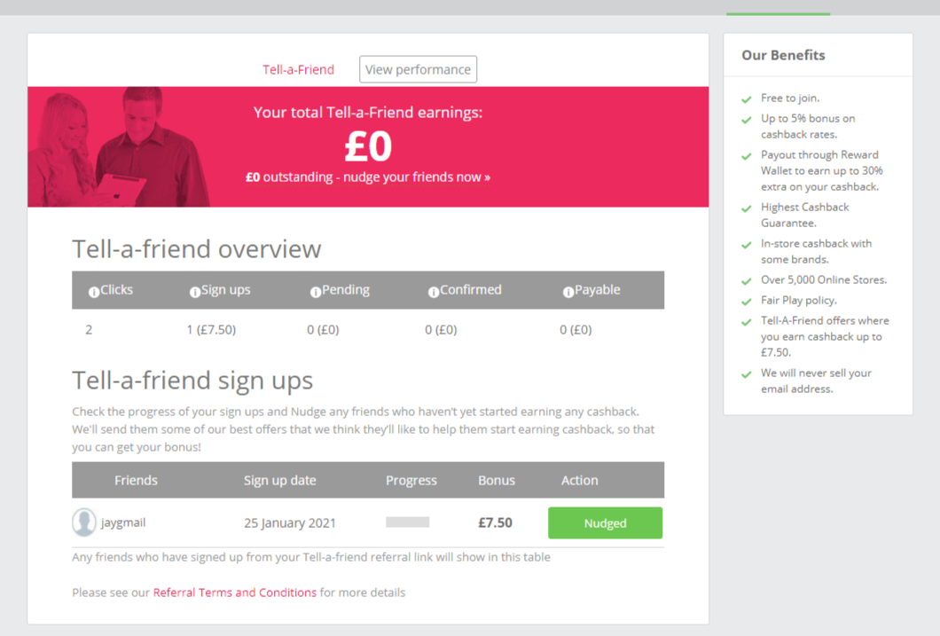
I began by analysing user behaviour through heatmaps to understand where users were interacting, which elements were effective, and which areas caused confusion or were ignored.
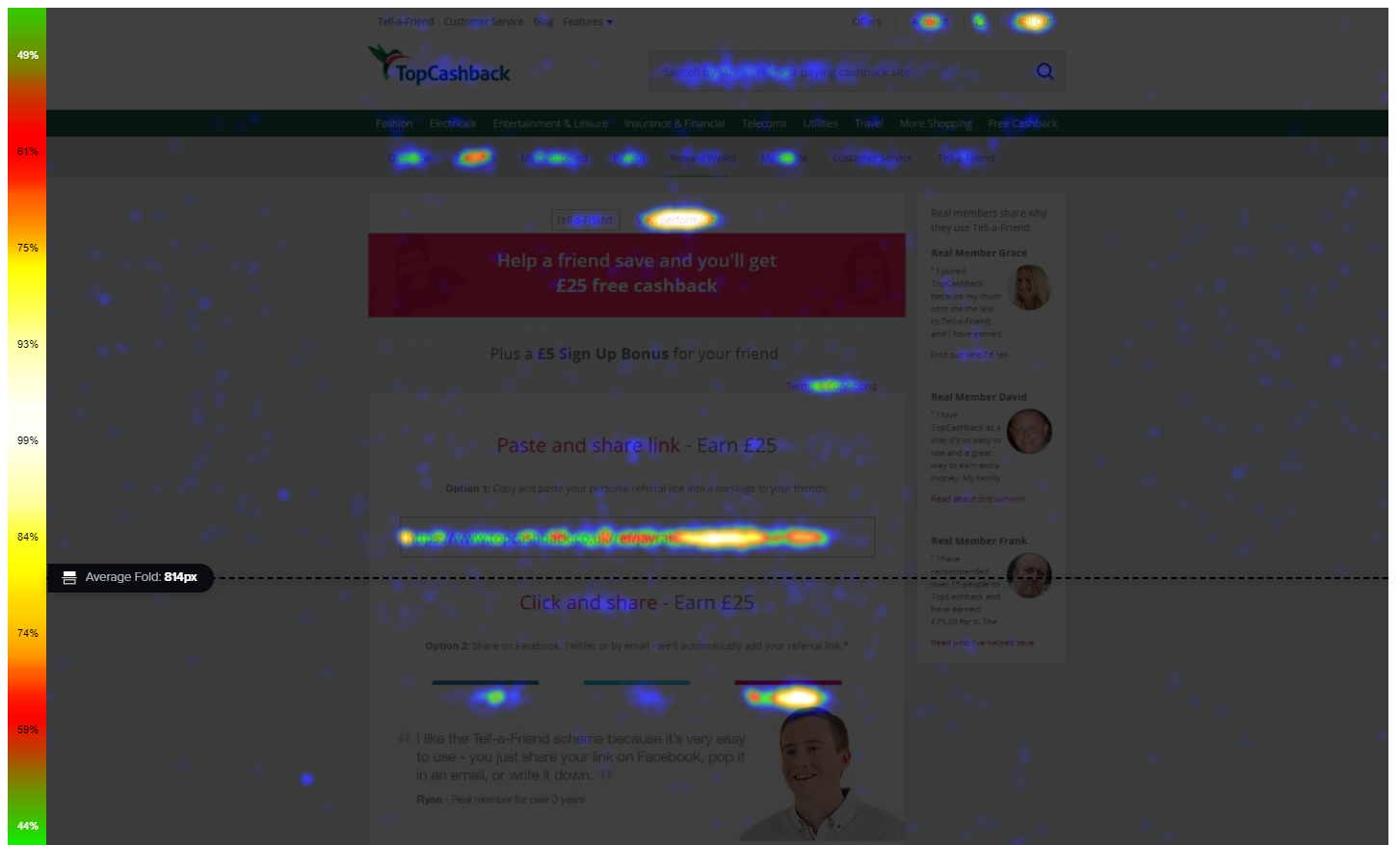
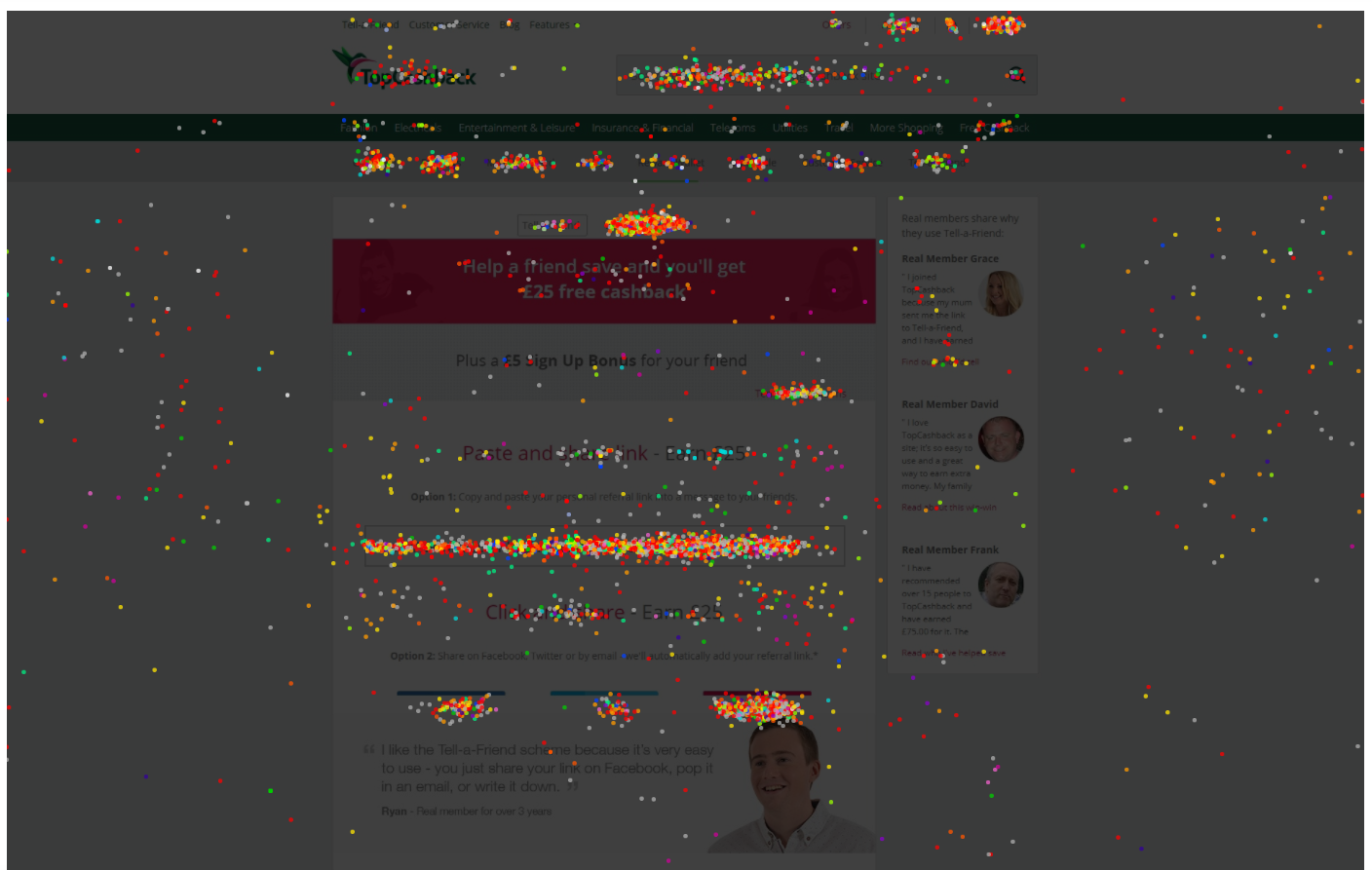
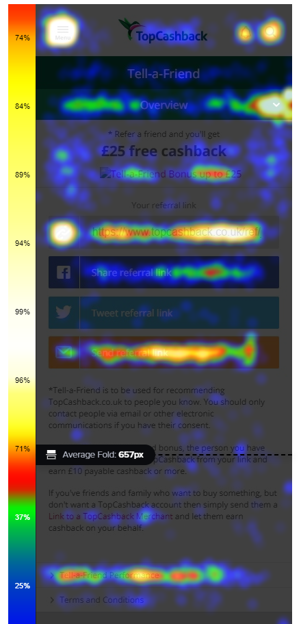
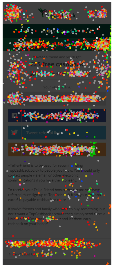
This gave me a good foundation, it revealed clear patterns, including users clicking on non-interactive elements indicating misleading affordances (i.e. elements that look clickable but aren’t).
I started with paper sketches, iterating on layout and hierarchy before moving into digital designs. Throughout this process, I collaborated closely with the rest of the design team to ensure consistency and alignment. I also ensured the page didn’t affect anything that Marketing used it for i.e. dynamically changing bonus rates.
 View full size ↗
Simplify the experience around the user's primary goal.
The key focus was simplifying the experience around the user’s primary goals; understanding the referral bonus, and quickly sharing their referral link. Everything else was treated as secondary or supporting content. A few key decisions:
- A need for a prioritised primary action (copy link): data from Google Analytics and Qlik showed that most users shared via copying their referral link. I made this the most prominent action.
- A need for reducing cognitive load: previously sharing options were presented as “Option 1” and “Option 2,” which felt unnecessarily complex. I simplified this into a clear primary action with secondary options grouped under “More ways to share.”
- Resolve misleading interactions: Users were clicking on static text such as “Paste and share” and “Click and share.” I redesigned these elements to better reflect their function and removed false affordances.
- Taking into consideration business and compliance needs: Important information such as referral thresholds and terms remained visible and clear, ensuring transparency and compliance.
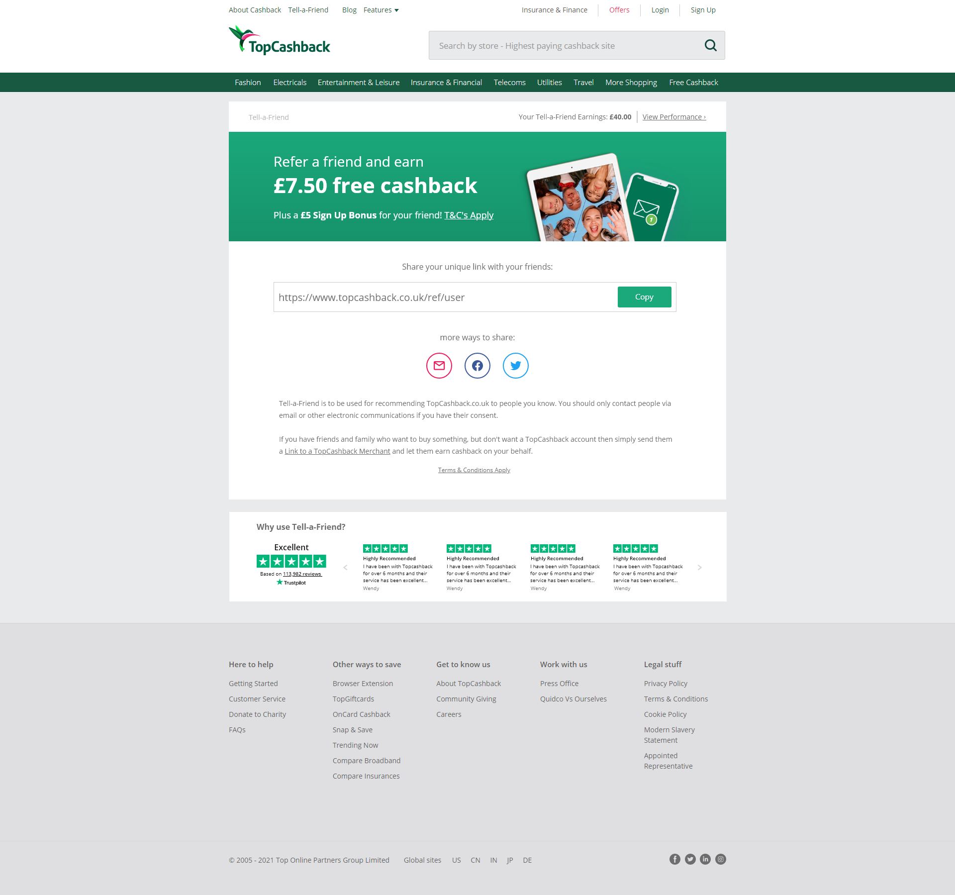
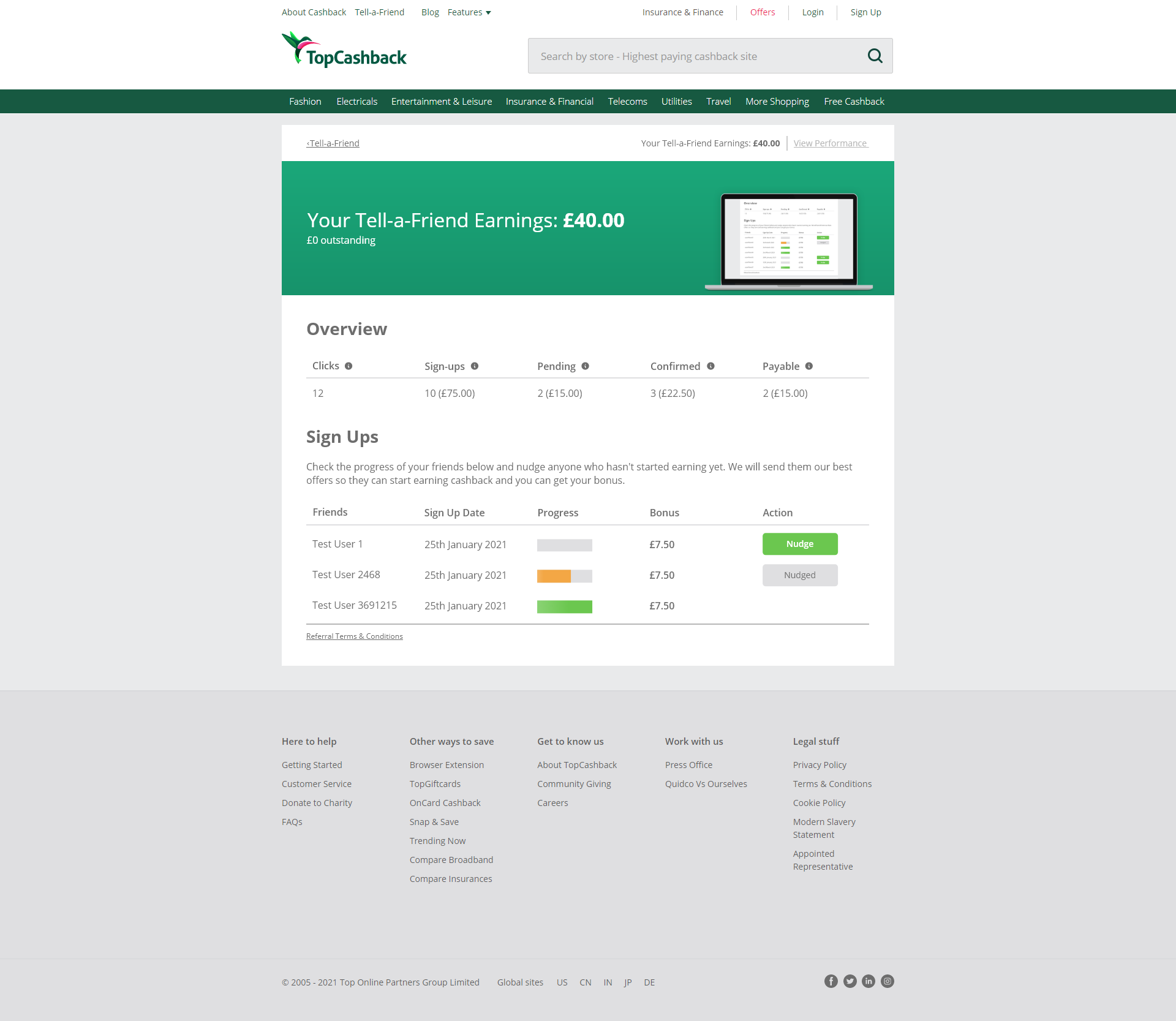
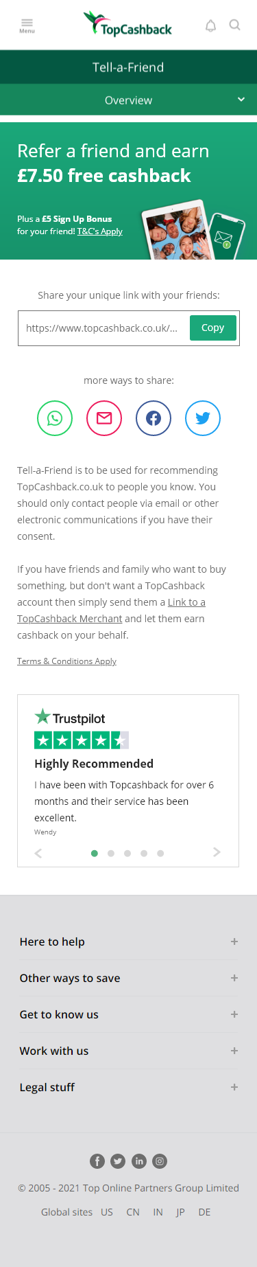
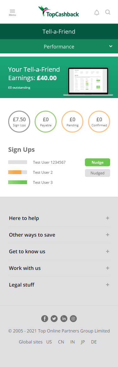
I also redesigned the View Performance page, where users track their referrals. Given its direct relationship with the referral page, aligning the UI ensured a more cohesive experience. The goal here was consistency rather than structural change.
Being such a valuable acquistion channel, we revisisted the design a few years later.
We revisited the referral experience as it had become one of our most valuable acquisition channels. The goal was no longer just visual improvement, but to enhance usability and effectiveness across the entire journey. This phase involved close collaboration with marketing, engagement, and customer service. We aligned on key priorities for the referral page, including reducing friction, improving clarity, and addressing common user issues raised through support channels.
We began by revisiting behavioural data through heatmaps, which showed that user intent remained largely unchanged since the initial redesign.
Rather than a surface-level update, we applied a MoSCoW prioritisation framework to define what the page truly needed.
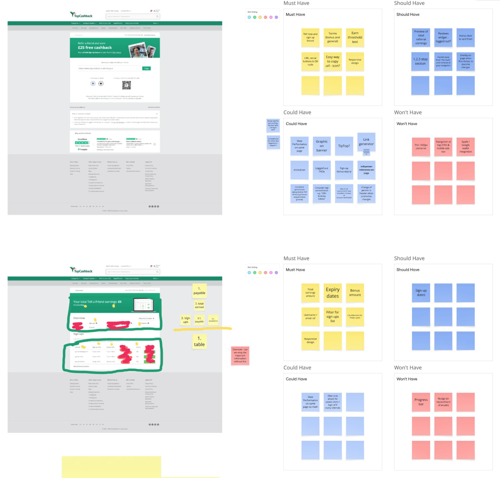 View full size ↗
We analysed a range of referral programmes (e.g. Wise, Rakuten, Dropbox, Zilch, Spotify) across web and app platforms to identify best practices and emerging patterns. In parallel, we ensured alignment with other ongoing design work across the platform to maintain consistency.
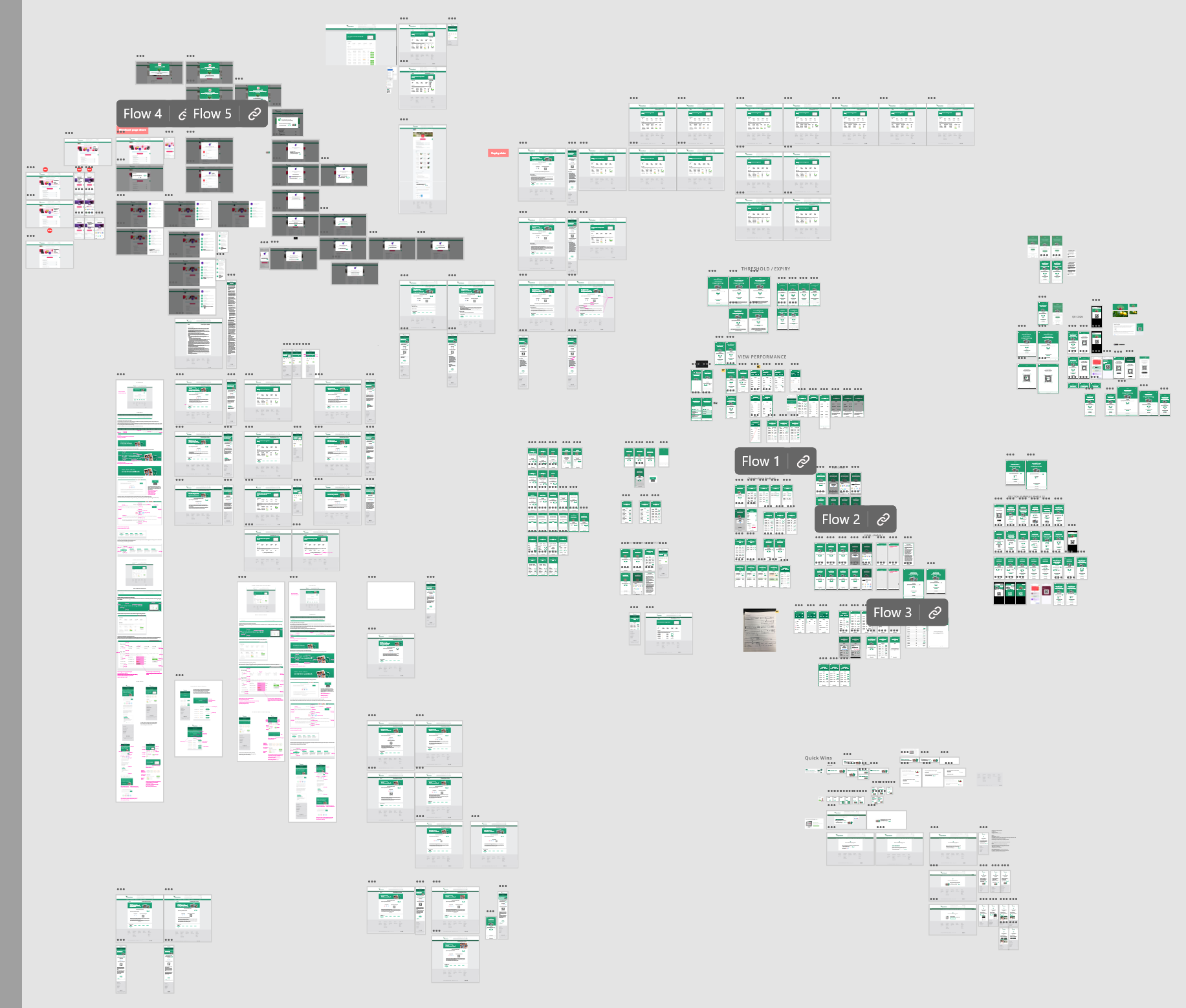
Using Miro, we explored wireframes, focused on making the referral process clearer, increasing the usefulness of the page, and trying to reduce the reliance on separate journeys. One key idea was to integrate referral performance directly into the main page, rather than requiring users to navigate to a separate “View Performance” page.
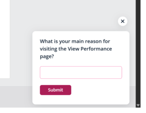
Before committing to this direction, we introduced a survey on the existing performance page to understand how frequently users visited it, and what their primary intentions were. The insights supported our hypothesis that users wanted quicker access to referral updates without navigating away.
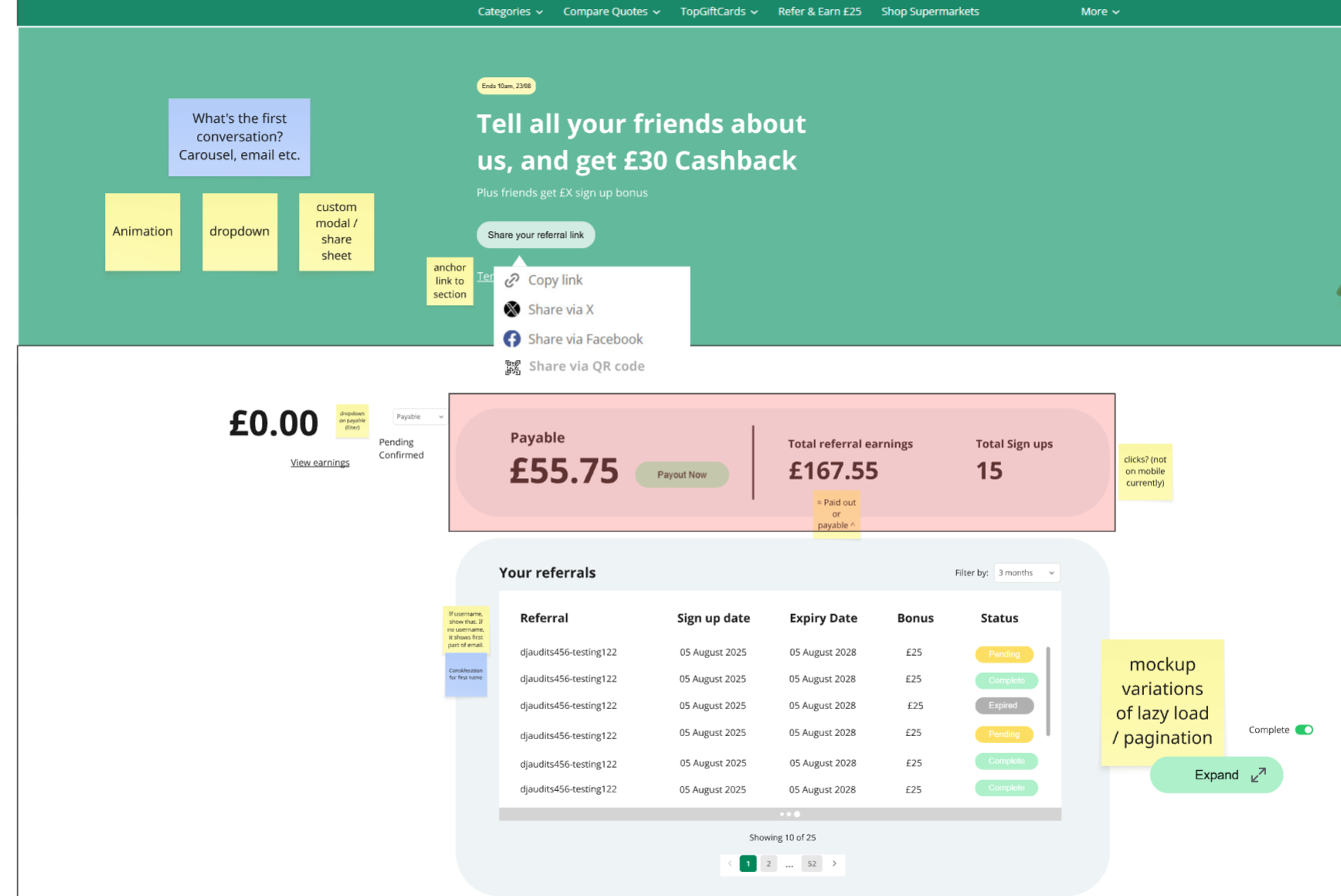
Before progressing to high-fidelity designs, we validated feasibility with engineering and security teams. This surfaced key challenges such as, users with a high number of referrals could cause performance issues, displaying referral data could expose sensitive information typically protected behind a verification wall. While solutions like pagination or lazy loading were possible, the security implications introduced friction that would negatively impact the experience.
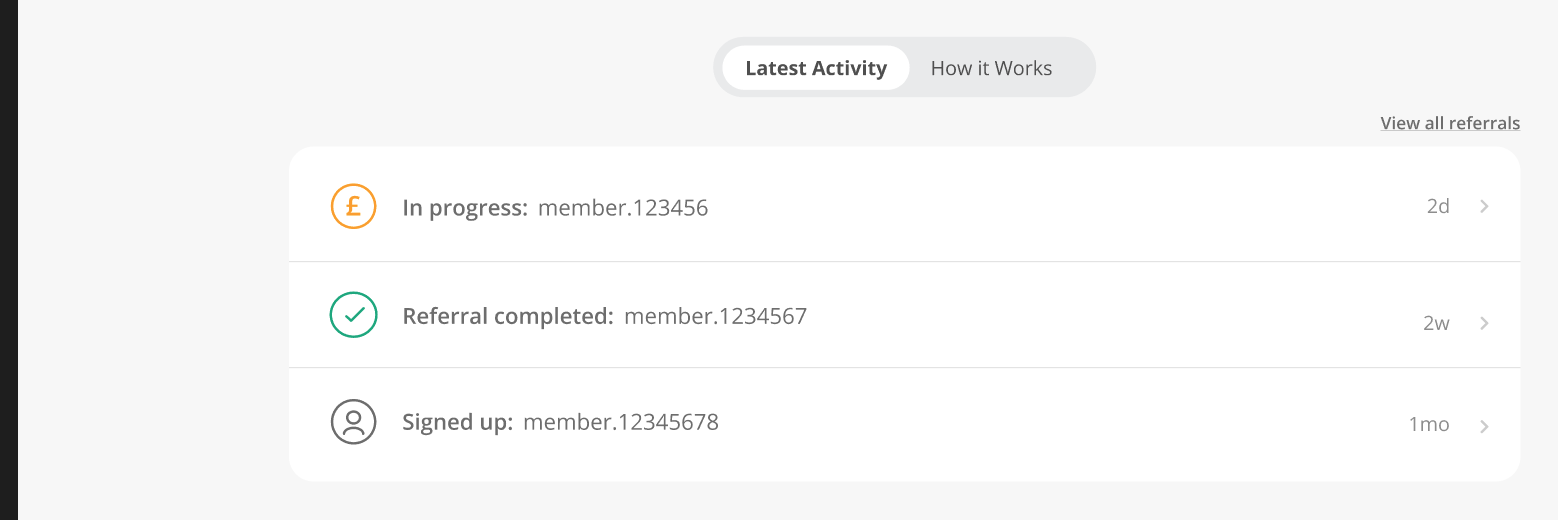
To balance user needs with technical and security constraints, we introduced a “Latest Activity” section.
 View full size ↗
This solution delivered meaningful insight while maintaining performance and security standards. The “Latest Activity” provided a quick, lightweight overview of recent referral updates, an immediate value without overwhelming the user. Additionally we did this without the need to expose full datasets or introduce additional security barriers.
After iterating in Figma, we developed a final prototype and presented it to stakeholders. We anticipated key questions and addressed potential concerns upfront. The solution was well received, with no blockers to development.
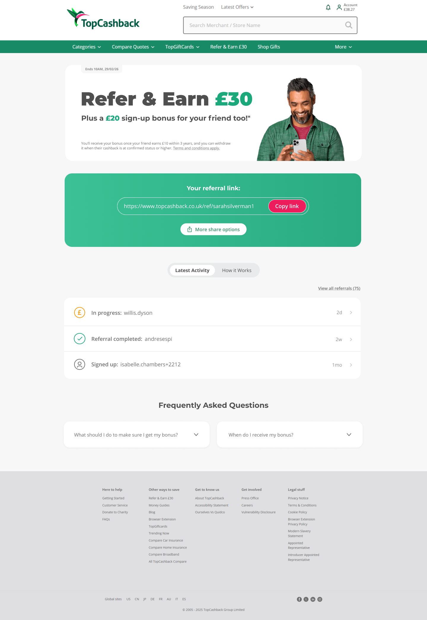
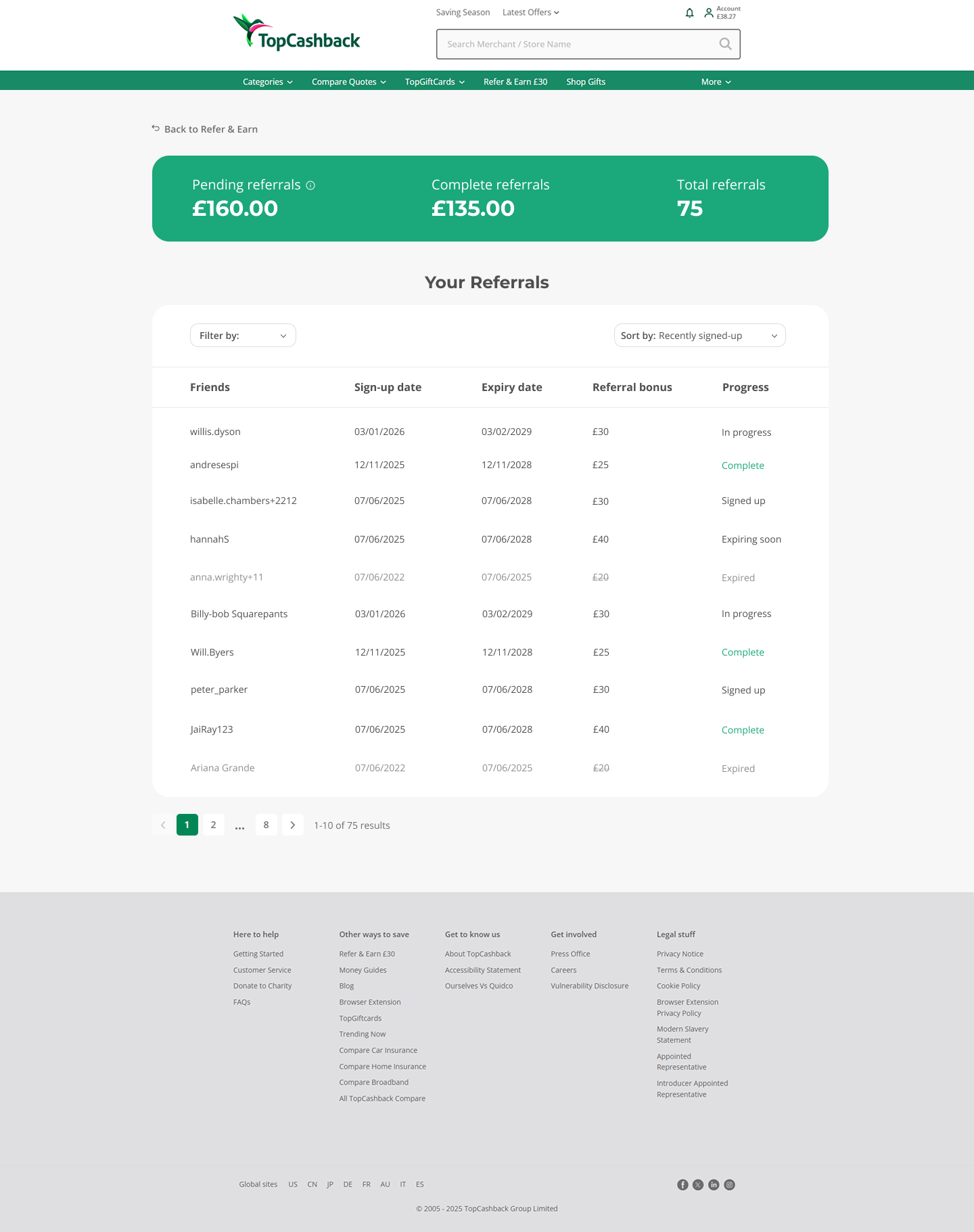


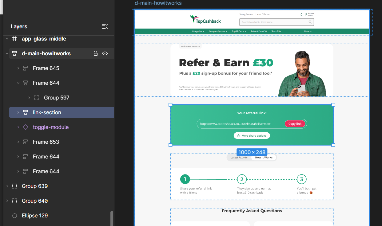
As I was building sections of content, and a table for the prototypes, I made extensive use of Figma’s Auto Layout and interactive components to ensure flexibility and consistency throughout.
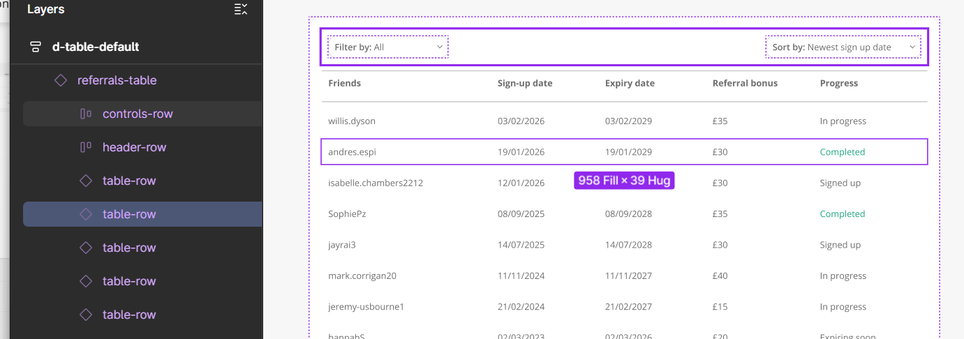
Auto Layout proved particularly valuable when designing the table, as it allowed me to efficiently manage dynamic rows, especially when exploring filtering functionality. This not only streamlined the design process but also made handoff to front-end development more seamless, as layouts behaved predictably and could be translated more easily into code. It also enabled other designers to reuse components with confidence, maintaining consistency across the team.
In addition, I incorporated interactive elements within Figma to simulate key user journeys. This allowed stakeholders to experience the flow in a more realistic way during presentations, making interactions tangible and easier to understand without relying on a verbal explanation.
Alongside the website updates, we also redesigned the corresponding experience within the app to ensure consistency across platforms. This included adapting the UI for dark mode, with colour adjustments aligned with the rest of the app.
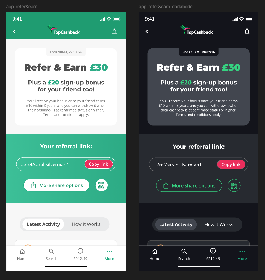
Our initial approach followed the mobile web layout. However, I identified a usability issue within the primary sharing section - the green container where users access their referral link. The number of available actions created visual and cognitive overload, making the experience feel cluttered. A key difference in the app experience was the use of the device’s native share sheet. While this streamlined sharing overall, it introduced an additional constraint: the QR code needed to exist as a separate action. As a result, users were presented with three distinct options, which risked reintroducing complexity.
I explored several approaches to rebalance the hierarchy between primary and secondary actions, including adjustments to colour, layout, and component structure to reduce visual competition. I also experimented with a more progressive solution, introducing a slimmed-down, persistent version of the section using a glass effect to reduce prominence while maintaining accessibility.
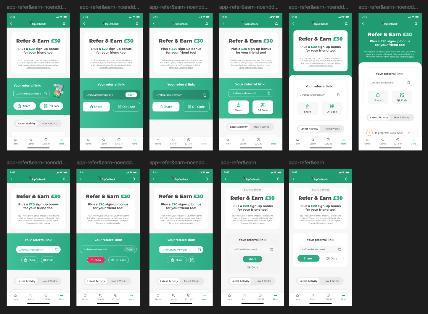 View full size ↗
After a group feedback session, we presented the rationale behind these explorations, including the potential benefits of adopting a more modern visual approach. Through discussion, we evaluated each option against user needs, platform constraints, and overall clarity. The final direction retained the three available actions but opted for a simpler UI to reduce complexity and improve hierarchy. This ensured the experience remained functional without overwhelming the user.
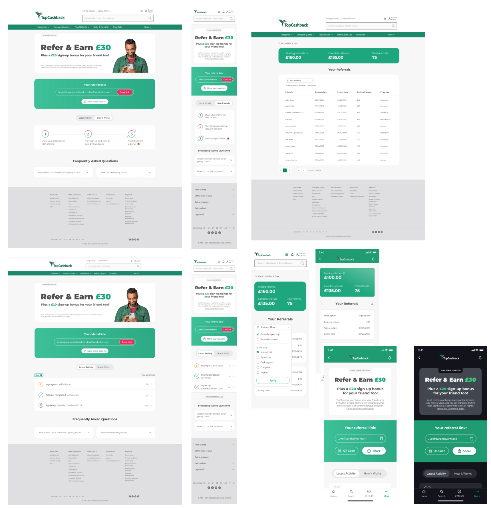 View full size ↗
The feedback session itself was valuable in broadening perspectives and validating assumptions, helping to surface UX considerations that were overlooked.
A further update to accommodate some accessibility concerns we ran into.
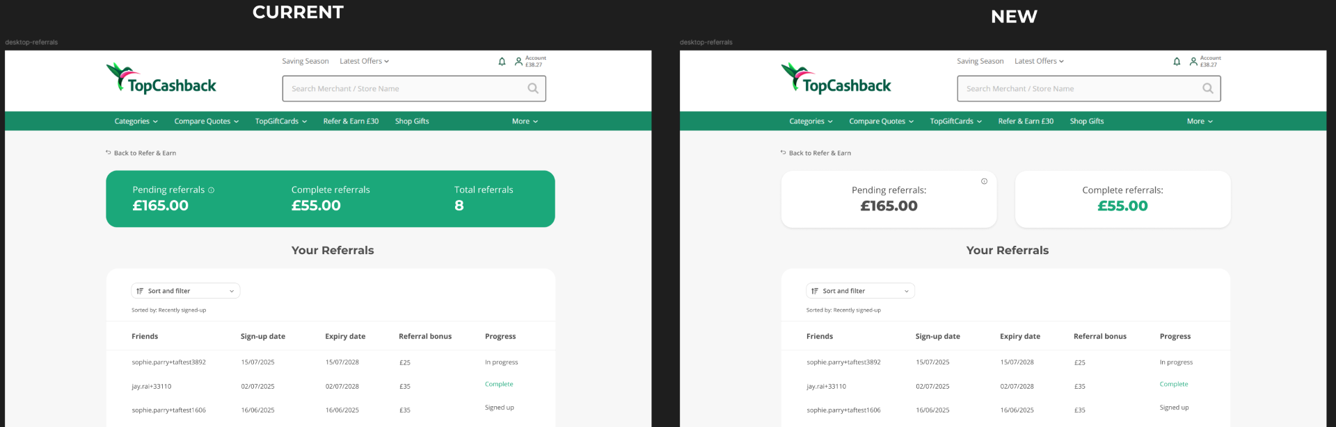
Another accessibility challenge we encountered was the use of white text on a green background, which did not meet the required WCAG contrast guidelines. I initially explored smaller adjustments such as adding text shadows and increasing font sizes, but these solutions began to negatively affect the visual balance of the UI.
 View full size ↗
To address this more effectively, I explored an alternative approach by separating the information into individual white containers. This immediately improved accessibility, while also aligning with patterns being established in another ongoing project. I further identified an opportunity to simplify the interface by removing one of the boxes entirely, as the same information was already being shown within the pagination. This improved hierarchy, and resolved the accessibility concerns without compromising the overall design.