At a glance
- Company
- TopCashback
- Role
- Lead UX/UI Designer
- Duration
- Ongoing incremental improvements
- Platform
- Browser extension
- Tools
- Figma, Miro, Adobe Suite, Analytics, Qlik, surveys
Redesigning a browser extension used by over 200,000 members. Creating a more adaptive Cashback experience across various regions.
The TopCashback Browser Extension notifies members when cashback is available while their shopping online, making it an important part of the wider cashback journey. With more than 200,000 users, small changes to its behaviour can have a significant impact on both the user experience and cashback activation.
I own the end-to-end UX for the extension and have continuously improved it using user feedback, behavioural data, and evolving commercial objectives. The most significant redesign focused on resolving a long-standing issue, the reminder needed to remain visible enough to be useful, without it becoming too disruptive during browsing.
This case study explains how analysing user frustration led to an adaptive approach, and a modernised interface.
I'm responsible for leading the UX/UI Design of the browser extension from discovery through to delivery. My responsibilities include:
User feedback consistently highlighted that the extension felt intrusive and disruptive. The popup performed an important role by alerting members to available cashback, but its size and timing meant it often competed with the users browsing.
The challenge was not simply to make the interface smaller. I needed to retain activation rates whilst giving users greater control over when and how they engage with the extension. Therefore my solution had to balance user needs with commercial objectives, and of course the technical constraints of the extension working across different retailer websites i.e. different retailers have different rules.
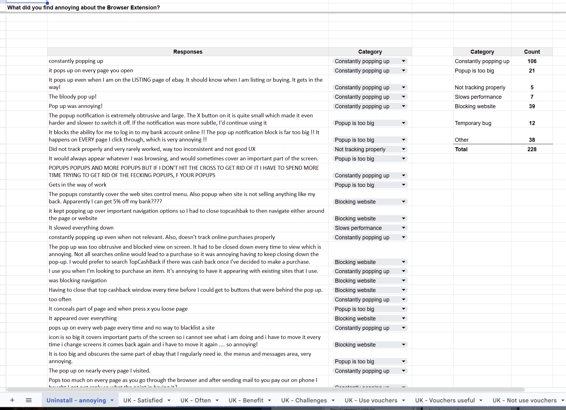
I gathered and analysed insights from multiple sources including creating a targeted user survey - understanding likes/dislikes about the extension, an exit survey triggered on uninstall, and looking through the extension store reviews.
Across all sources, the feedback was consistent in that users understood the value of the reminder. However, they found the experience overly intrusive during browsing.
I audited the complete extension journey, reviewed historical data from 2014 onwards and compared several competitor extensions. This helped me understand and think about how the extension should handle visibility, and be less annoying whilst persistent.
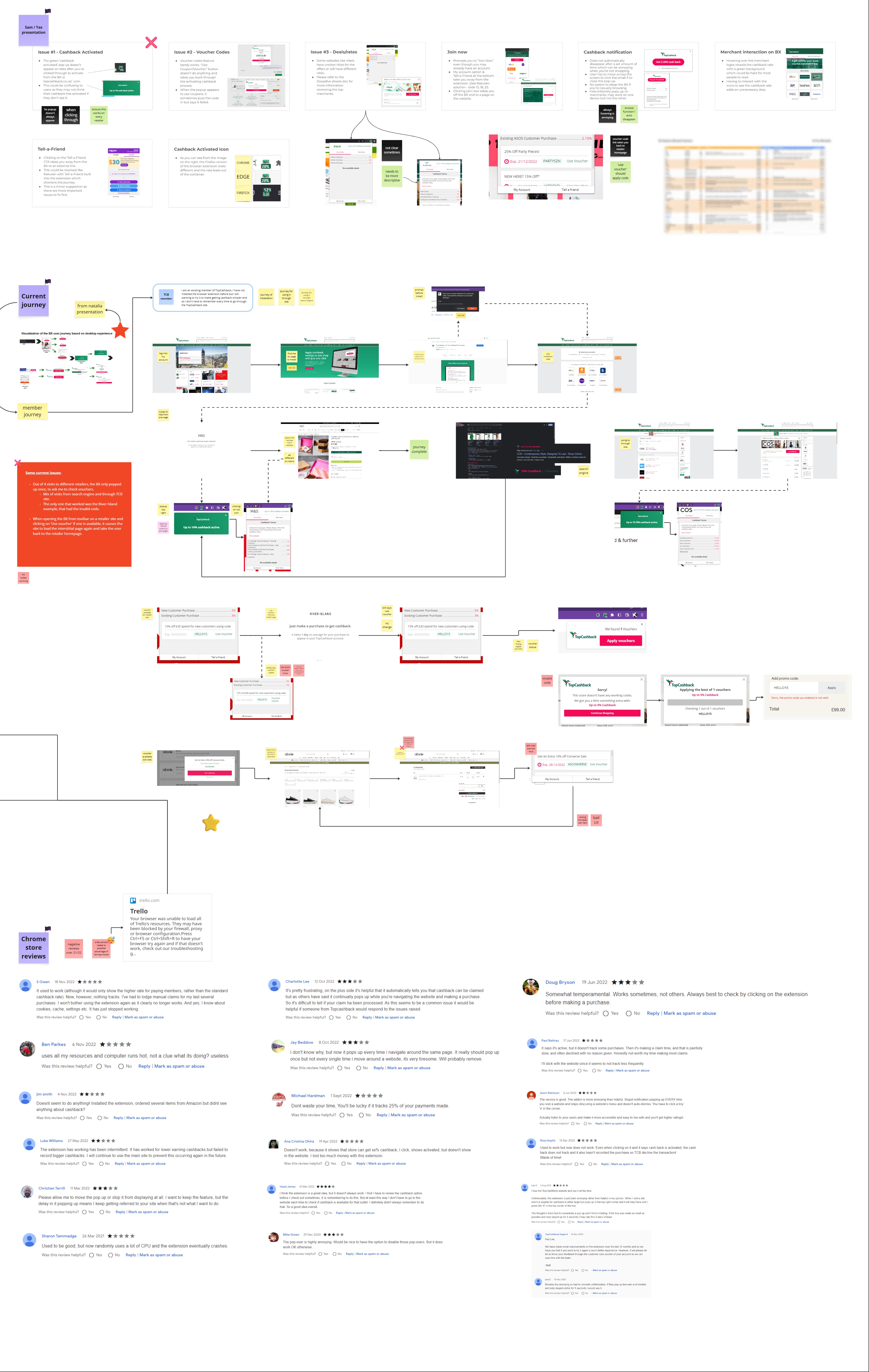
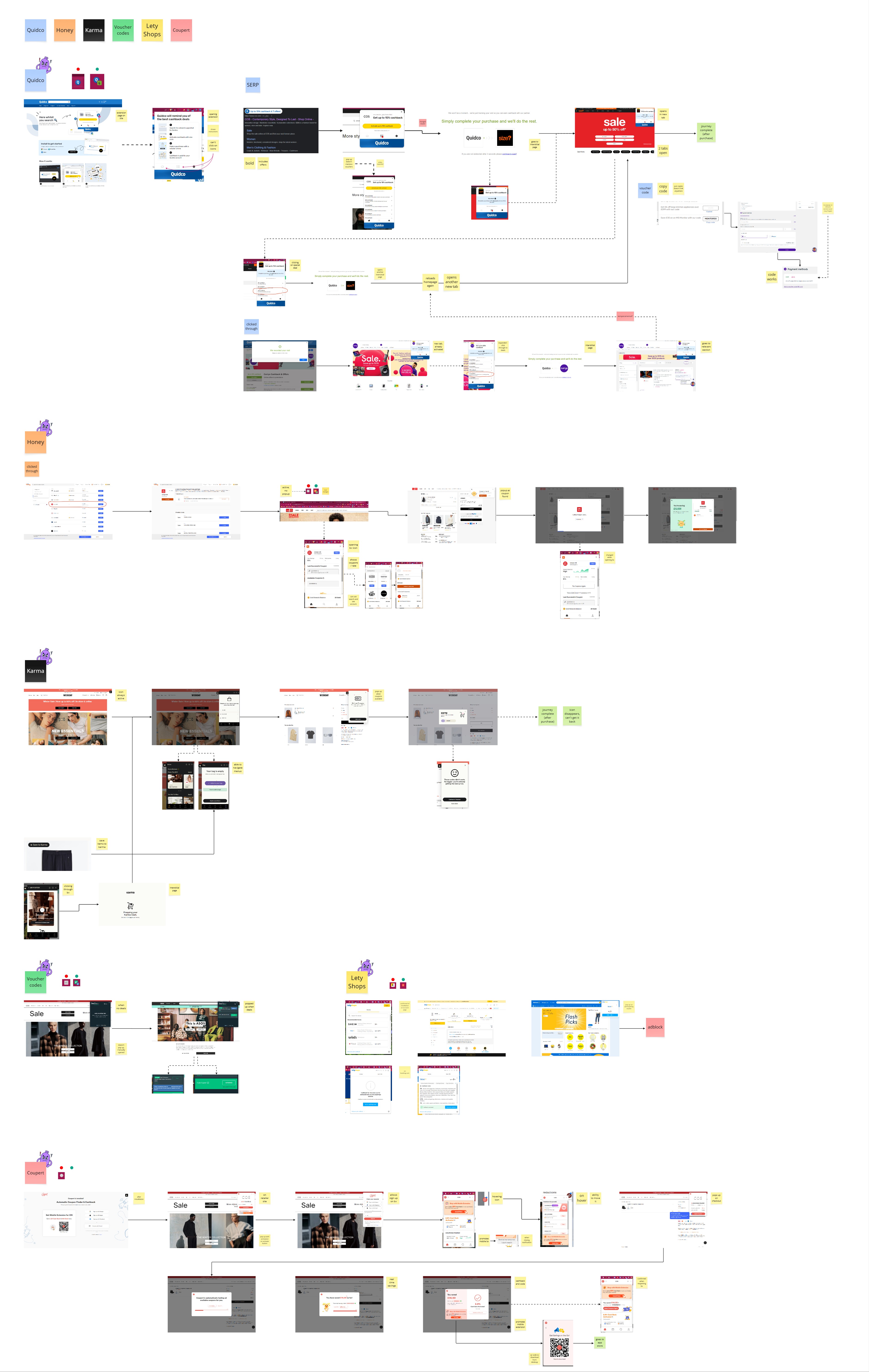
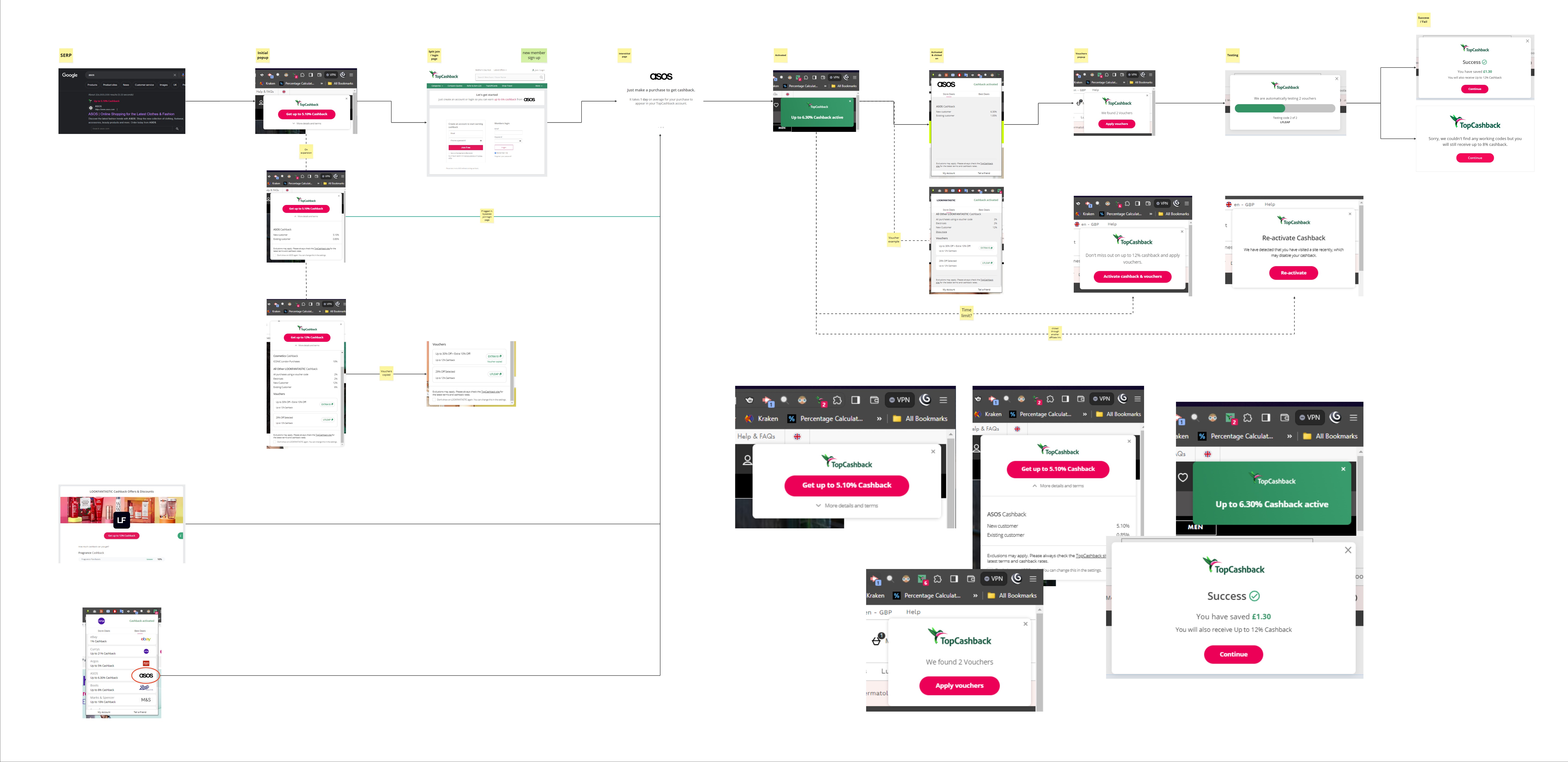
The research highlighted important findings:
The question was, how might we reduce interruption and potential annoyance, without losing visibility and engagement?
I explored a range of concepts that varied the popup's size, timing, and level of user control. The goal for me was to find a way for the extension to remain noticeable when cashback first became available, but reduce its prominence once the user demonstrated that they were actively browsing. The solutio became clearer.
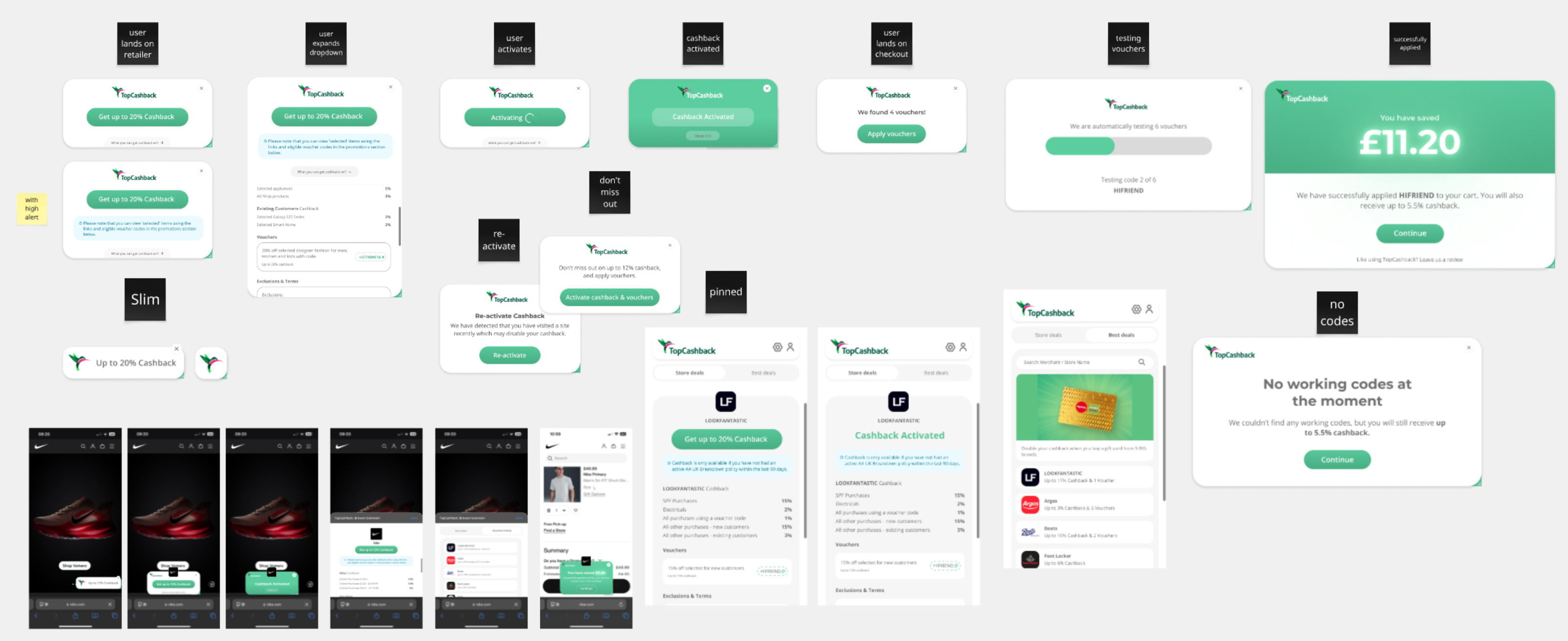
Alongside that, I explored a more modern visual improvement that aligned the extension with TopCashback's brand. I refined spacing, tested hierarchy changes, sizes, and implemented motion to ensure the experience felt purposeful.
Through iterations and stakeholder meetings, the strongest direction was an adaptive two-state solution. The extension would initially communicate the cashback opportunity as a pop-up, then minimise into a compact badge when the user began scrolling. This created a behavioural response to user intent rather than asking users to repeatedly dismiss.
The final solution introduced an automatic badge mode. When cashback is first available, the extension presents the full reminder so the opportunity is clear. Once the user begins scrolling - indicating active browsing - the extension minimises into a compact badge and sticks to the side of the browser.
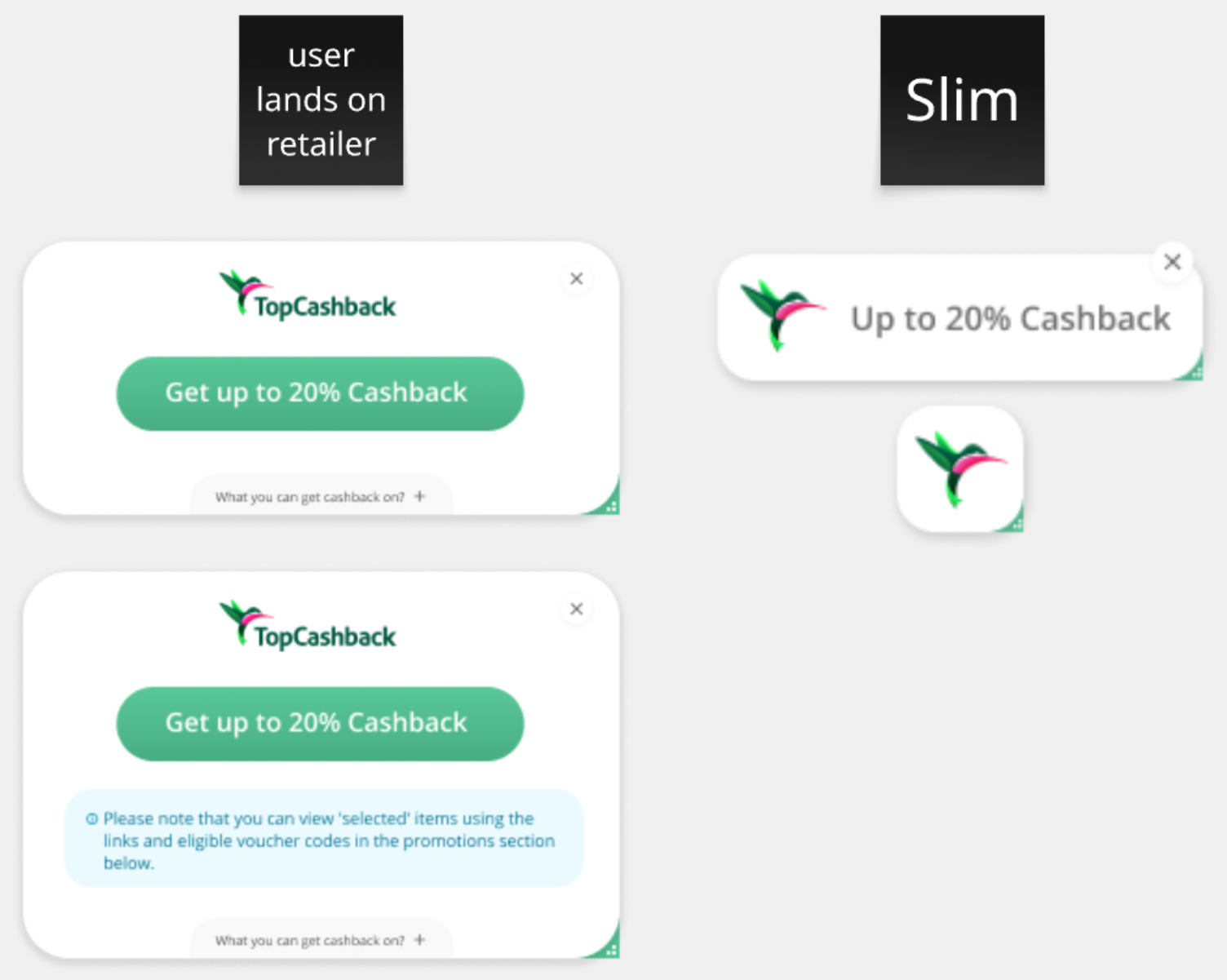
Minimising the reminder during scrolling reduces disruption without removing the cashback opportunity. The badge remains visible and can be expanded whenever the user is ready for cashback, allowing the extension to stay helpful without competing for attention at the wrong moment.
I also modernised the interface, improved it visuallyby bringing in a consistent style with gradients and corner radius. I also introduced subtle animation to make the transitions feel smoother and more intentional.
Throughout the project, I worked closely with the browser-extension stakeholder team, and external/internal development teams. Collaboration was particularly important because reducing the extension's prominence could affect cashback activation rates, while retaining the existing behaviour could risk continuing the frustration identified through research.
The redesign reduced one of the extension's most consistent pain points without compromising its core goal. By creating this adaptive experience, the extension remained visible whilst giving users greater control over when they engage with it.
Following the changes, the number of users closing the extension decreased by 54% in the UK and 52% in the US. The UK Chrome Store rating also increased from 2.9★ to 3.4★, providing further evidence that the experience was being received more positively.
The extension continues to evolve, and I use ongoing surveys and behavioural data to identify further improvements to badge timing, interaction and visual treatment.
Further improvements will be added here.