At a glance
- Type
- Freelance
- Role
- Lead UX/UI Designer
- Duration
- Ongoing
- Platform
- Web application
- Tools
- Figma, Miro, Adobe Suite
Designing a secure digital register for veterinary practices, replacing paper-based record keeping. Ensuring clearer workflows, stronger safeguards and overall a more reliable way to manage sensitive information.
In my spare time, I've been working with a friend on a controlled drugs registry for veterinary practices. I'm leading the design of the platform, helping vets to not rely on paper-based record keeping with a more secure and efficient digital solution.
This project has required me to understand the legal implications around compliance for veterinary practices, whilst the importance of speed and efficency.
I am leading the end-to-end UX/UI design, working directly with the client/developer from helping to shape requirements through to detailed prototypes and implementation support.
Veterinary practices are legally required to maintain accurate records for controlled drugs, but paper-based processes can make information harder to retrieve. This increases the risk of count discrepancies, and generally create security concerns around sensitive records.
The challenge was to translate a complex set of regulatory and operational requirements into a web application that remained secure and useful for everyday staff. The system also needed to support detailed records, error preventions, reporting and generally be a fast application to learn and use.
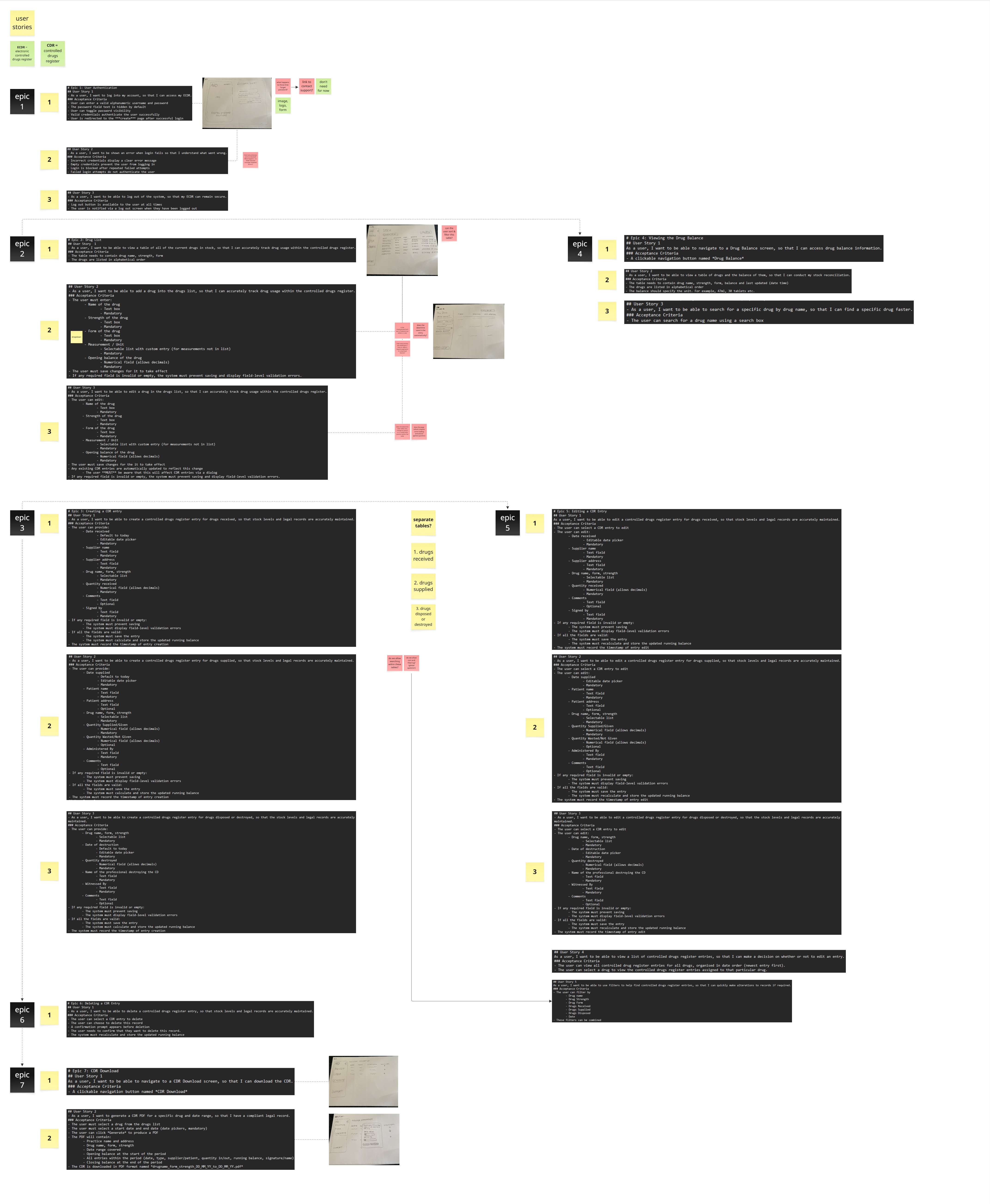
My starting point was to analyse and understand the user stories in detail. This allowed me to establish the foundations of the system, map key paths, and identify opportunities for improvement, or areas where further clarification was needed before I began.
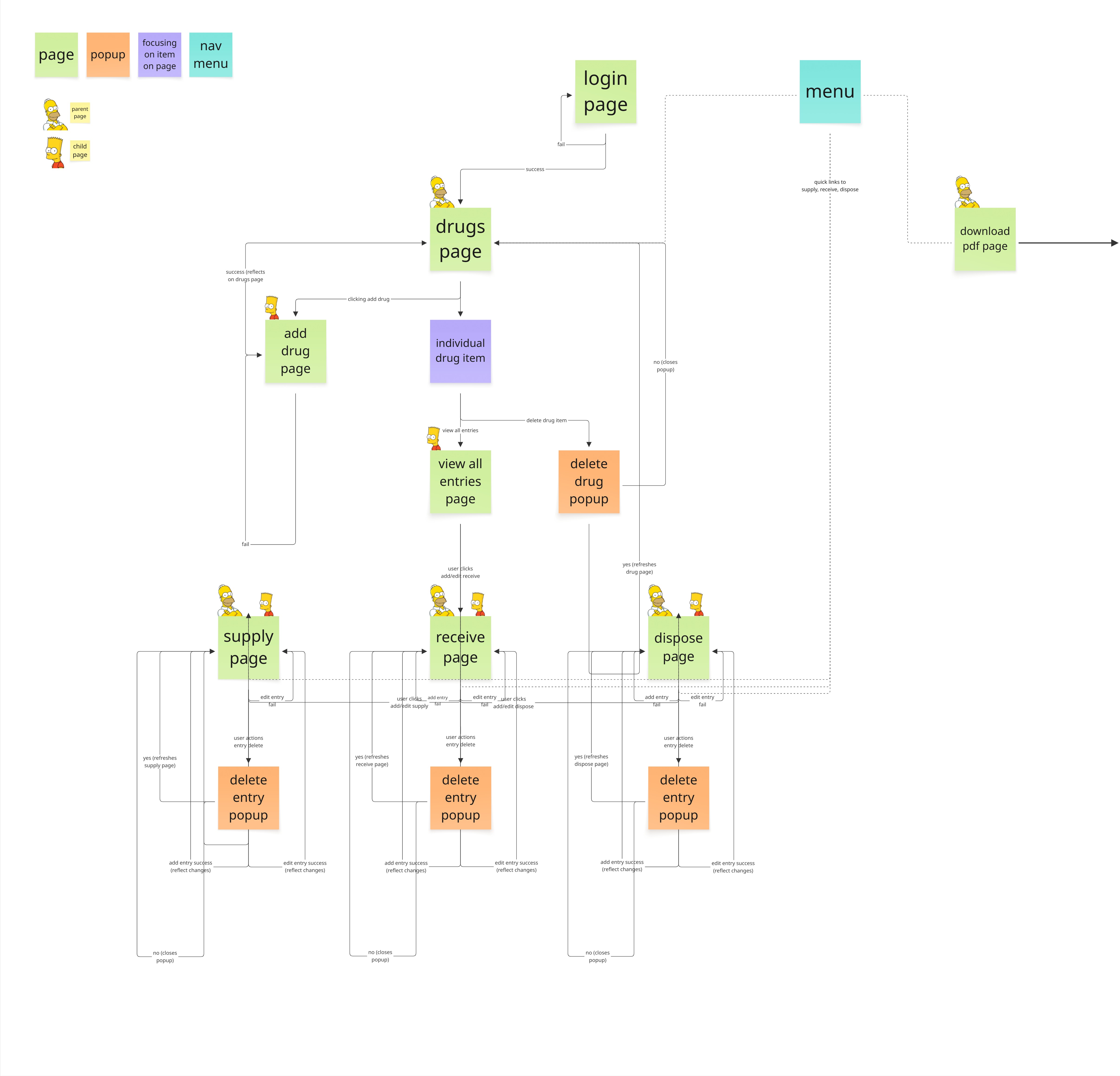
Before designing individual screens, I created a complete sitemap of the platform. This helped visualise the structure, and uncover potential user errors, edge cases, and decision points. Collaborating closely with the client at this stage was key in validating the system architecture and ensuring we had a solid foundation before progressing into the design.
The discovery phase highlighted:
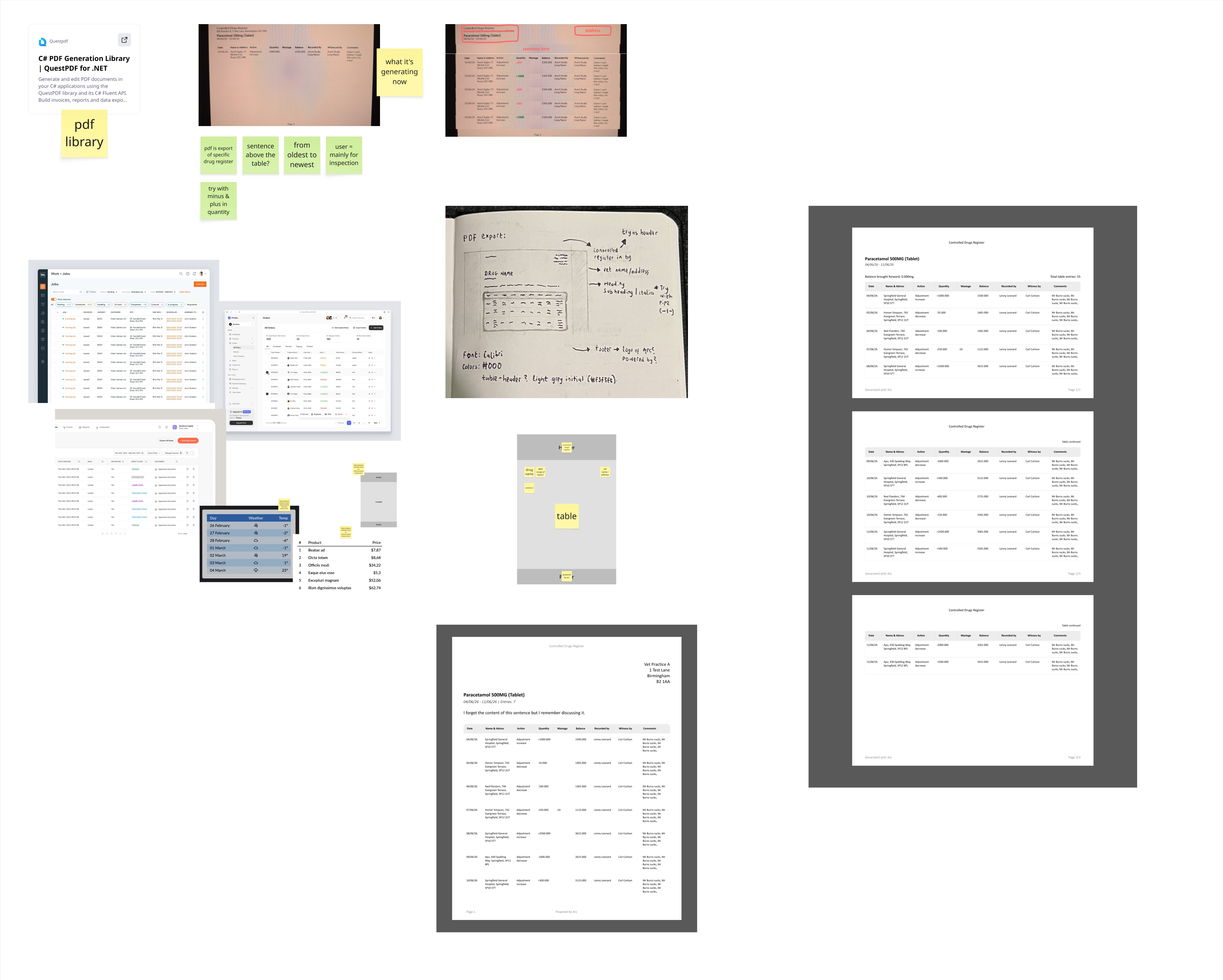
One of the first tasks was redesigning the exported PDF reports. Although a relatively small piece of the system, the functionality had already been developed, making it an ideal starting point. Using the existing .NET PDF library as reference, I redesigned the layout to improve readability and ensure important information could be reviewed quickly and efficiently by veterinary staff/inspectors.
The login experience was the first major area explored. Whilst initially appearing straightforward due to the absence of signing up, it quickly revealed several important security considerations.
Mapping this journey raised a number of questions:
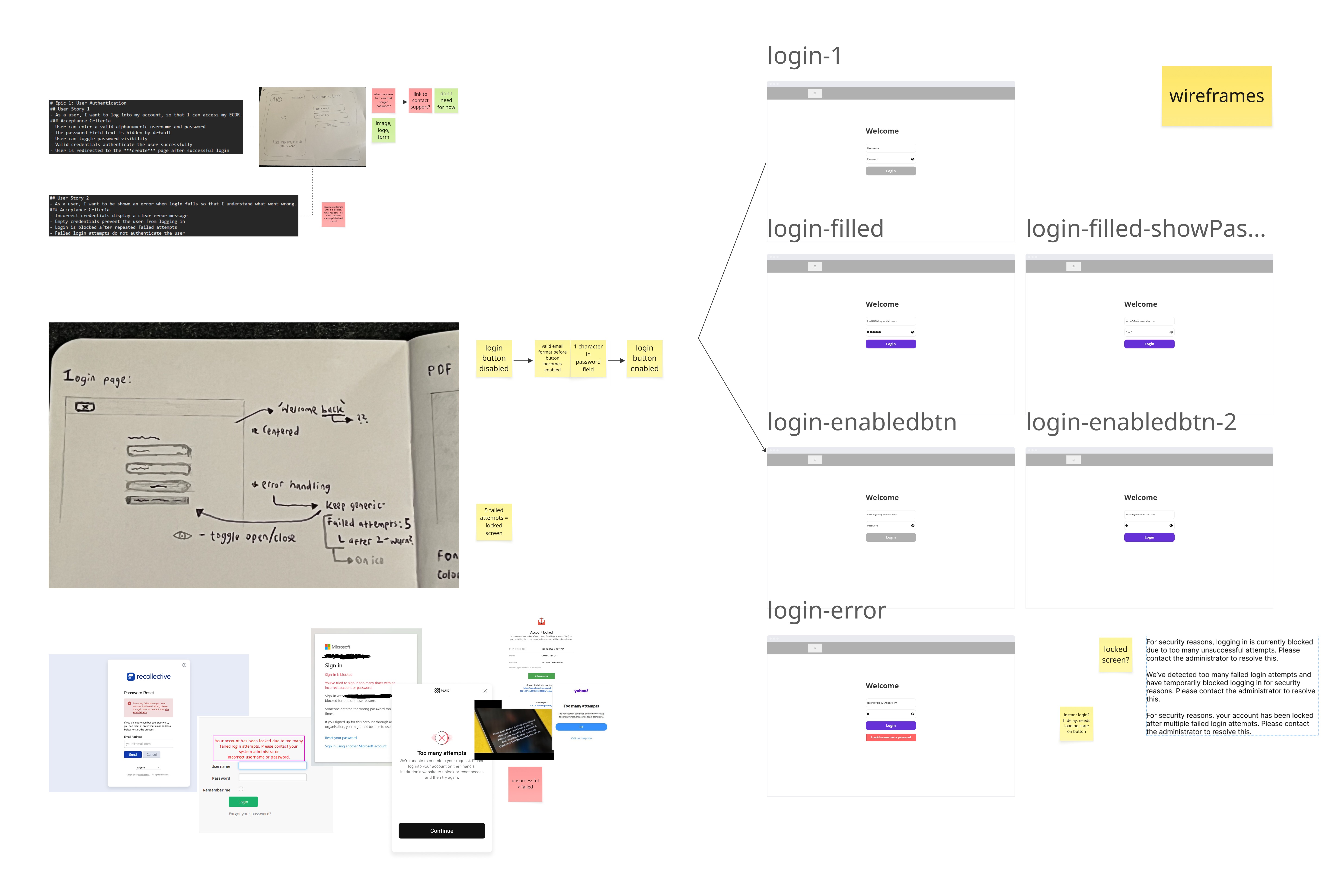
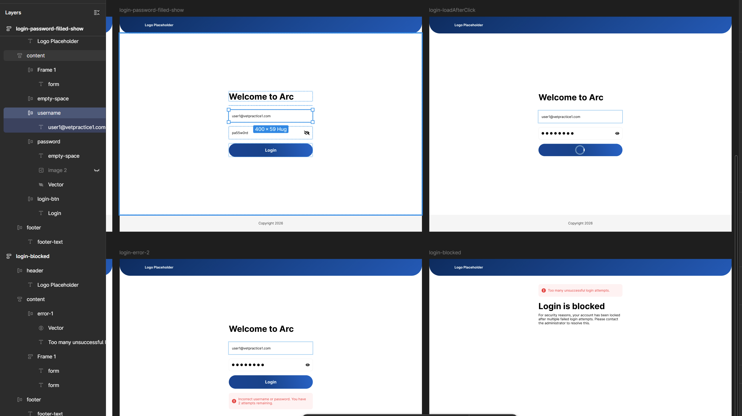
Once these scenarios had been defined, I translated the wireframes into interactive prototypes. This included designing all key states within the login journey, such as enabled and disabled login button states, escalating error messages as users approached their final login attempt, and the ‘locked screen’ experience.
Following authentication, users are taken to the Drugs List - the central hub of the system. From here, they can view every controlled drug in the register and carry out key actions such as supplying, receiving, disposing of, editing, or removing records. Given that most user journeys originate from this screen, it was important to establish a clear foundation before designing the surrounding journeys.
I started with wireframes on paper, using the user stories to map the core structure and identify how the different actions would fit together. At this stage I intentionally focused on the primary journey rather than every edge case.
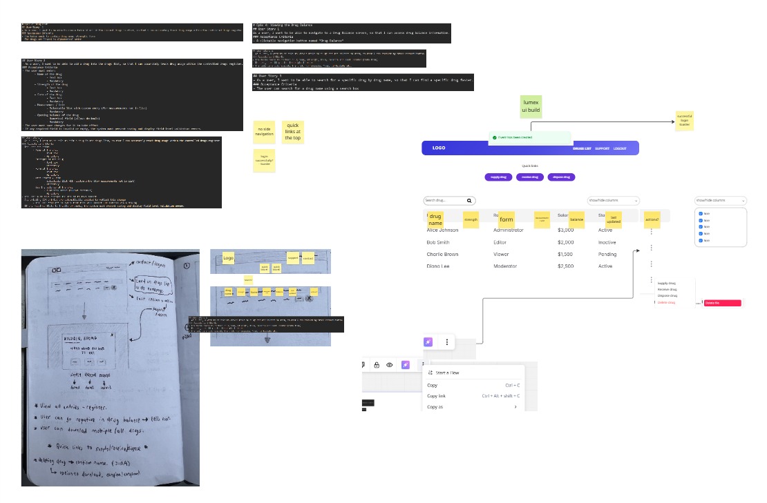
As the design evolved, I worked closely with the client/developer to validate ideas early and ensure they were technically feasible. These conversations became particularly valuable when I learned that the front end would be built using a framework.
Understanding the framework allowed me to work within an established design system whilst retaining the flexibility to introduce bespoke solutions when they added value. It also influenced several design decisions, e.g. I used a vertical ellipsis to group secondary row actions into an overflow menu, reducing visual clutter within an already information-heavy table.
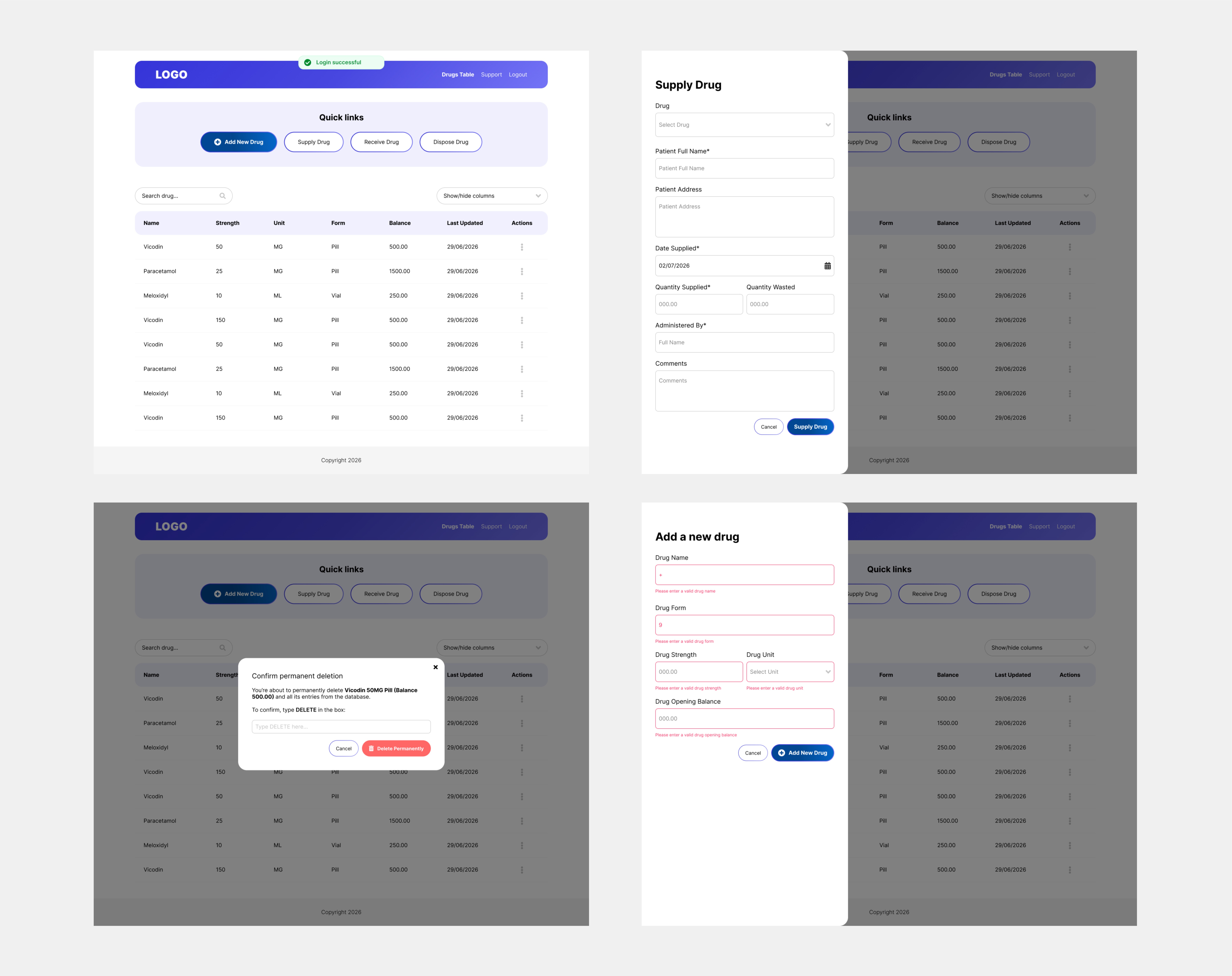
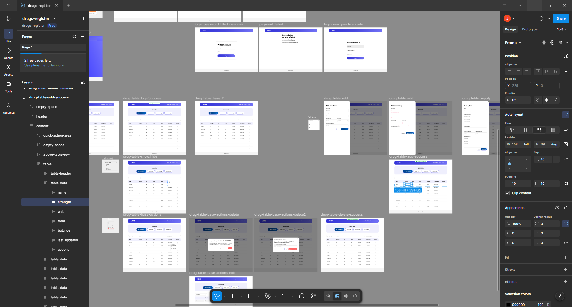
Final solutions will be available when project has launched. 🚀
The project has been delivered using an agile approach, so I have worked closely with the client/developer throughout. My aim has been to stay ahead of the build where possible, allowing me to clarify journeys and adapt designs when technical constraints or edge cases emerge.
Working directly with those defining and building the product has made design decisions more immediate. Regular conversations have helped throughout e.g. validating the sitemap, confirming security behaviour, aligning designs with frameworks, and avoid progressing too far with ideas that would not be feasible.
The work completed so far has established the structure and design direction for the application.
The project is currently in progress, there are currently continous updates to requirements following changes in the law. Those changes may impact how the system can work, however the existing flows and designs provide a strong foundation once the revised requirements are confirmed.