At a glance
- Company
- TopCashback
- Role
- UX/UI Designer
- Duration
- 6 months
- Platform
- Website & app
- Tools
- Figma, Miro, Adobe Suite, HTML/CSS, Analytics
Redesigning a core navigation system used across web and mobile to improve findability, support future growth and create new commercial opportunities without disrupting familiarity for users.
The navigation is one of the most important parts of TopCashback. It is where countless user journeys begin, helping users discover TopCashback's range of retailers, products and services.
As TopCashback categories continued to evolve, the existing navigation had reached its limit. New categories could no longer be added top-level without compromising usability and disrupting the UI.
What initially appeared to be a simple UI update quickly became a improvement to the information architecture. The project required rethinking how content was organised, how members discovered categories, and how we could create a system to solive this whilst remaining familiar to millions of existing users across desktop and mobile.
This case study explores how the redesign evolved into a wider exercise in simplifying usability, and improving flexibility for the business.
I was responsible (along with 2 other UX/UI Designers) for the UX/UI design of the navigation overhaul across desktop and mobile. My responsibilities included:
The existing navigation was focused on retailer categories and could no longer accommodate the growing range of categories. Adding more top-level would have increased clutter, yet moving familiar options into nested menus risked disrupting established user behaviour.
The challenge was to create a navigation system that could improve findability and perhaps increase the exposure of TopCashback's products without reducing engagement to the categories members relied on.
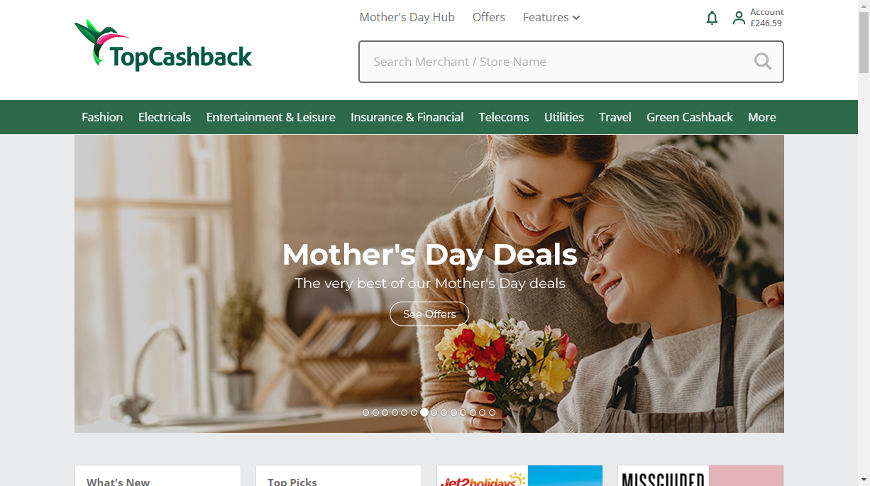
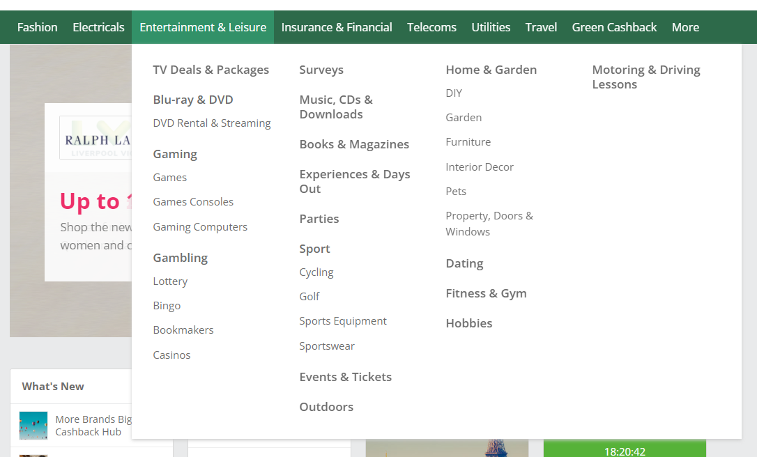
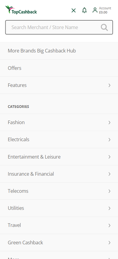
The old navigation was heavily category-focused and did not showcase the wider range of products/services available through TopCashback.
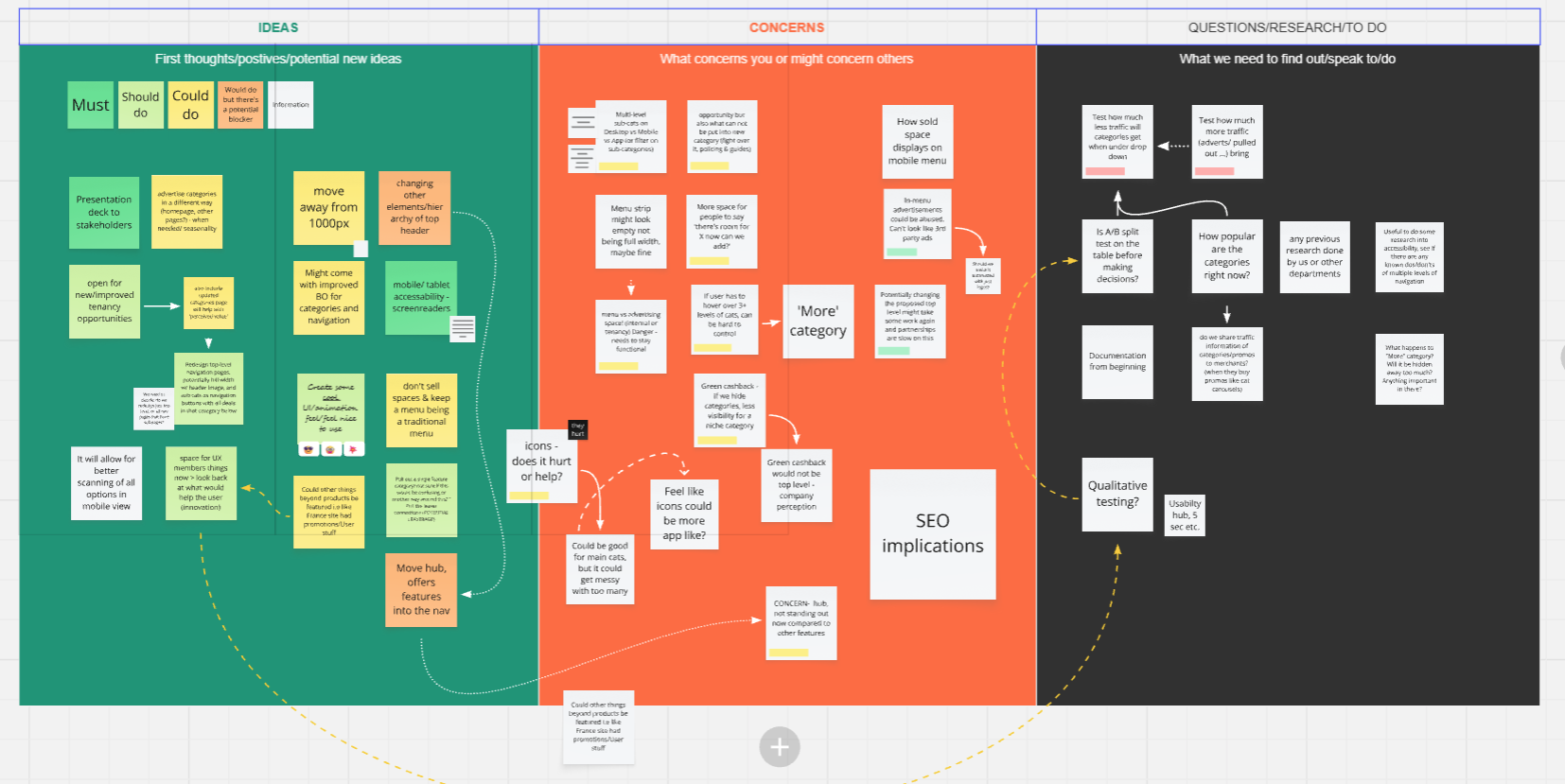
We began by mapping potential solutions, with concerns and constraints. While introducing a dropdown seemed straightforward, it raised several important UX considerations:
Given the amount of categories on TopCashback, I conducted a full audit of all the categories and their subcategories. I identified duplicates and outdated categories, I mapped hierarchical relationships and I also defined a cleaner, more scalable structure.
These updates were documented and handed over to the relevant teams to ensure the taxonomy remained accurate.
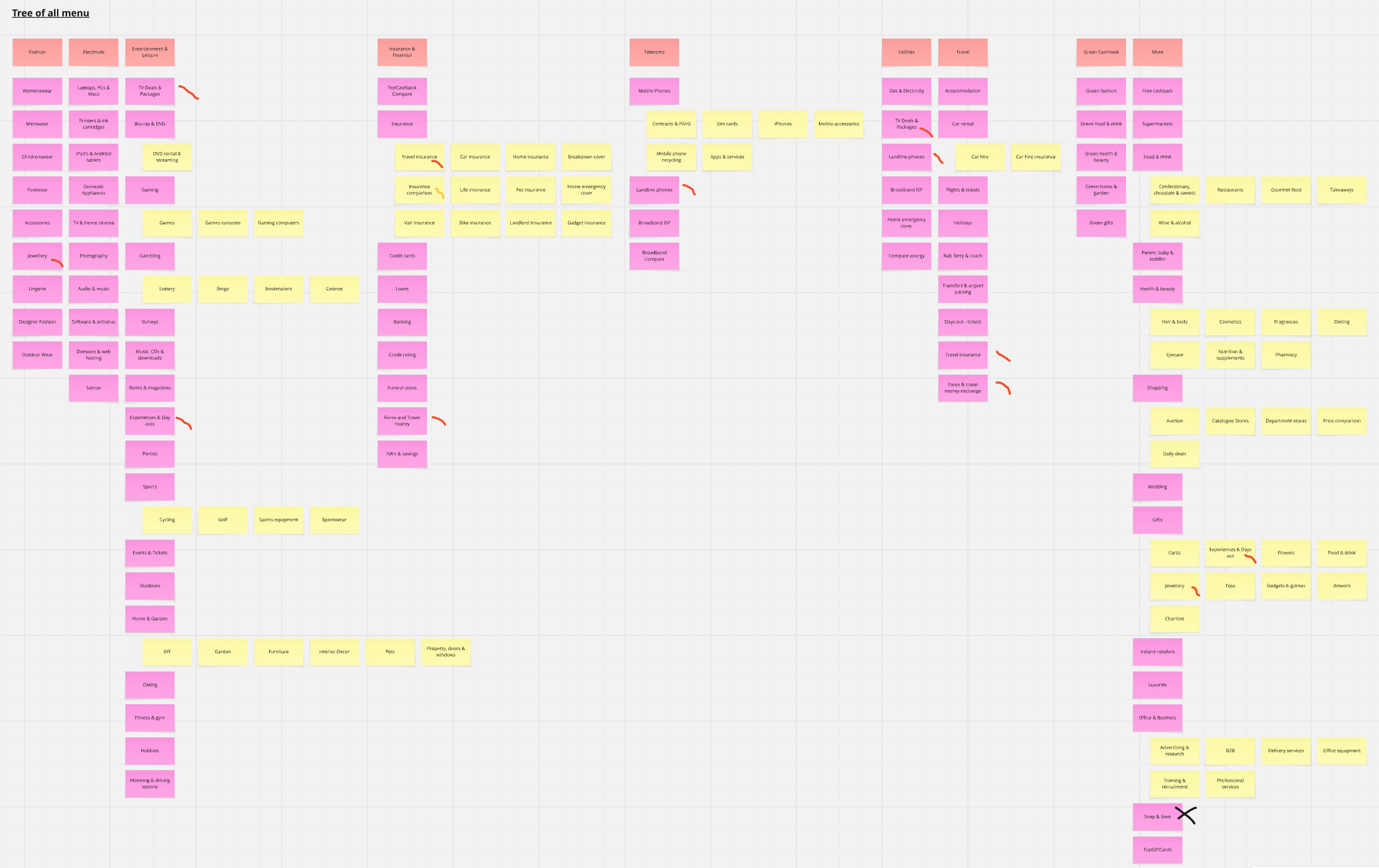
Before designing, I explored how other platforms handled large-scale navigation systems, and how to organise dense information without overwhelming users.
Google Analytics showed that just over half of users accessed the site via mobile. Desktop users relied heavily on the navigation bar, this shaped the approach where clarity and efficiency were particularly important on desktop while patterns still needed to adapt appropriately across platforms.
The discovery work highlighted priorities for the redesign:
I explored how categories could be consolidated into a structured mega menu. The design needed to make categories easy to scan, maintain a clear hierarchy and remain flexible enough to accommodate future categories.
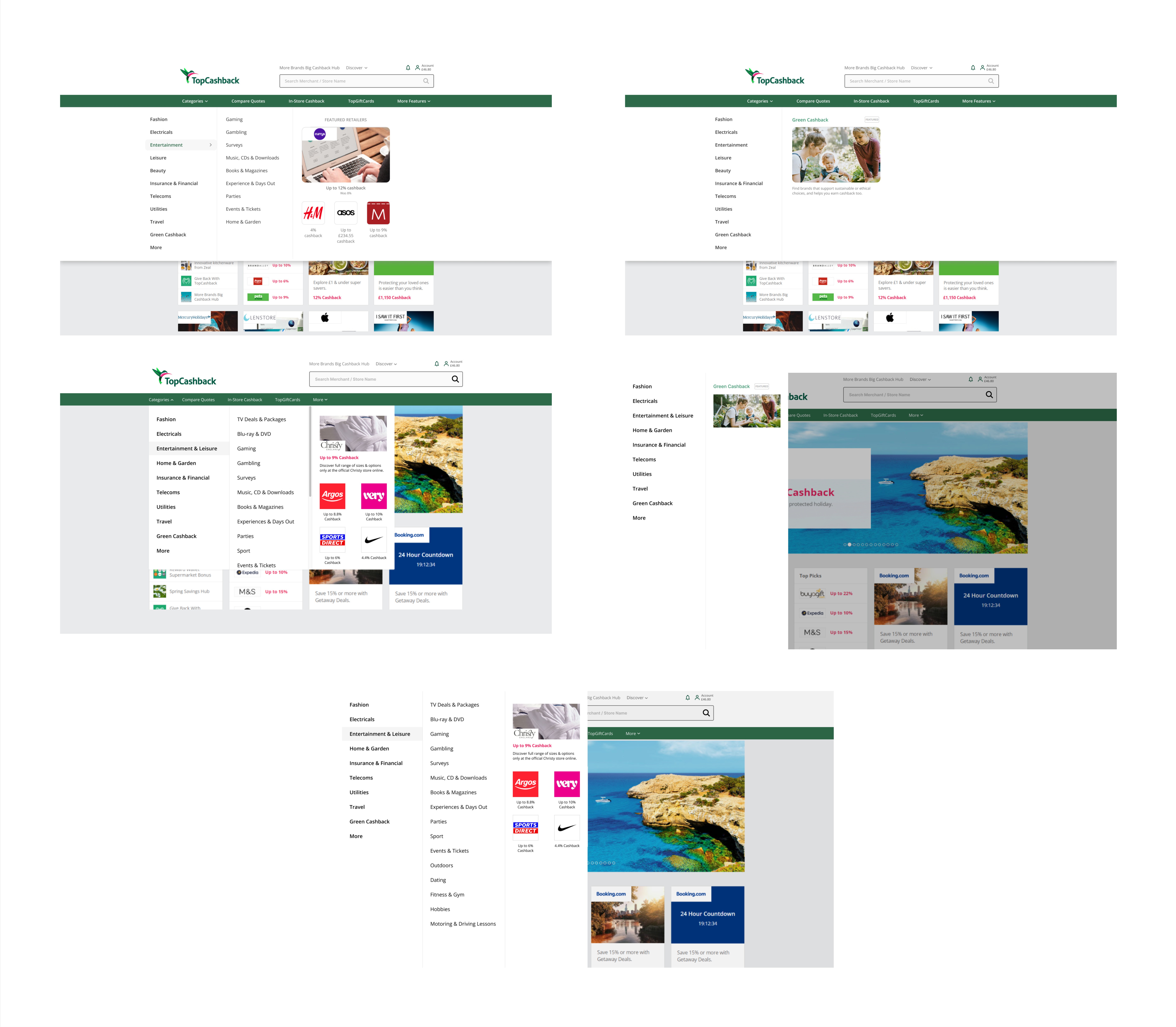
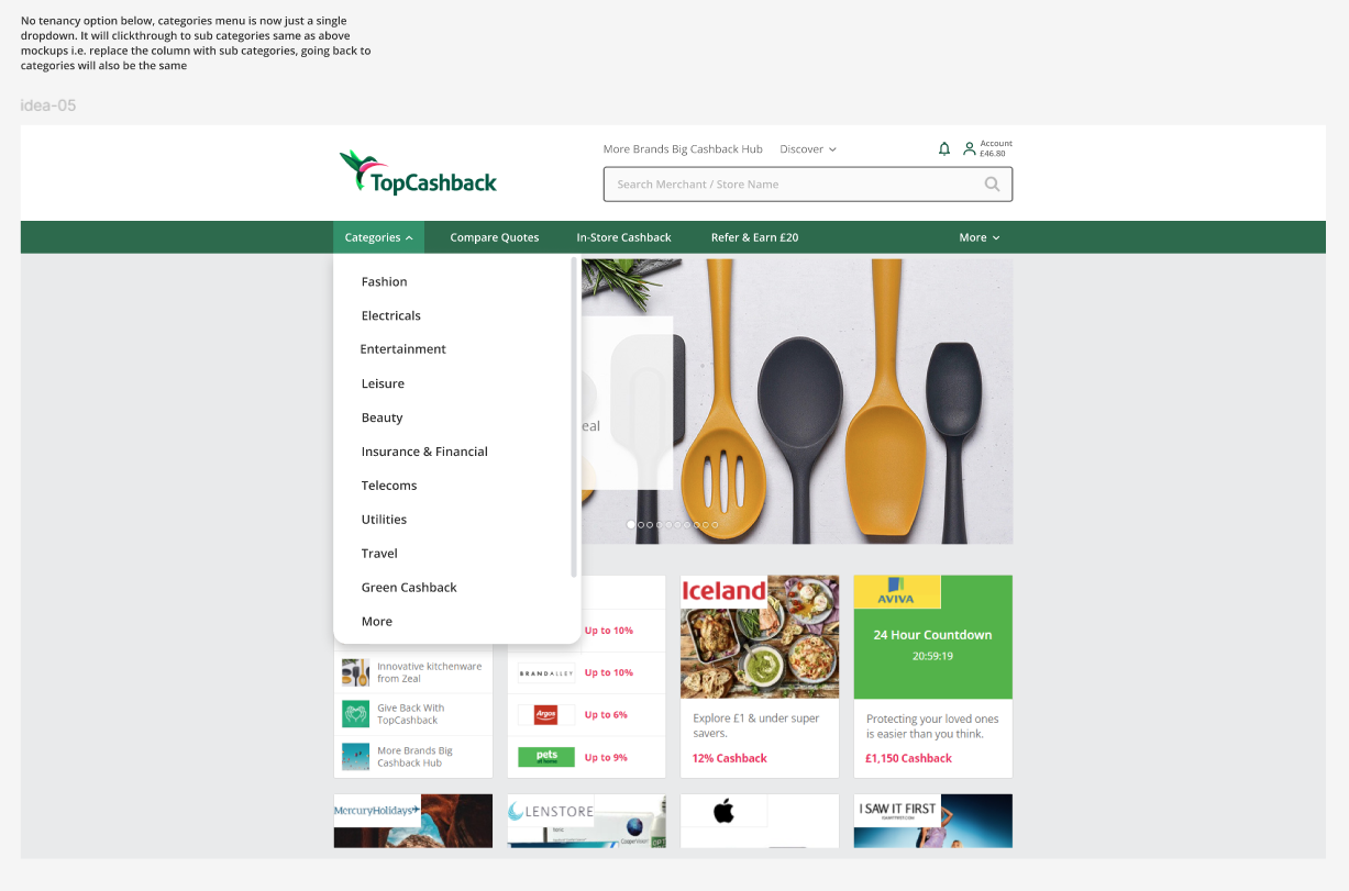
The final solution introduced a mega menu-style dropdown on desktop. Users could access top-level categories or drill down into subcategories. I made categories easier to scan while reducing clutter in the main navigation bar.
On mobile, the same structure was adapted, this preserved consistency in how content was organised.
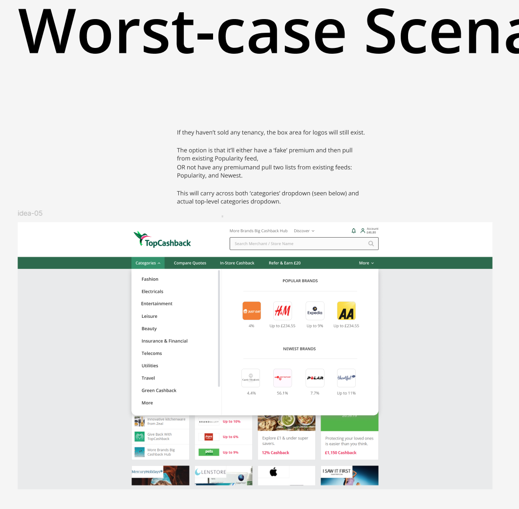
The redesigned navigation made category browsing more intuitive and gave TopCashback space to promote internal products and introduce retailer tenancy placements. Additionally, there was a temproary space for a seasonal item that could be changed i.e. if it is summer and there's an increase in travel bookings, the temporary space could be used for a travel category.
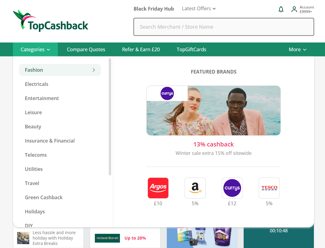
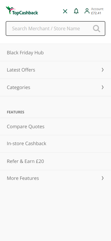
The promotional placements within the dropdown were introduced, allowing retailers to advertise within relevant categories and creating additional revenue opportunities.
TopCashback's key internal products such as Compare, Gift Cards and Refer & Earn were elevated to the top-level navigation, increasing their visibility.
The system also included flexible fallback states for regions where tenancy placements had not been sold or were not required.
In this project I was 1 of 3 UX/UI Designers, collaborating closely to create this solution.
This project impacted a lot of teams, I worked closely with them and other stakeholders throughout to ensure the new solution met requirements.
The category audit required input from teams responsible for maintaining the categories, whilst the new promotional areas needed alignment around tenancy requirements and fallback behaviour.
The updated navigation has been live for several years with strong performance indicators. Despite the structural changes, there was no drop-off in category engagement and no increase in customer service queries related to categories.
Traffic increased to newly promoted product areas, whilst the flexible promotional placements created additional opportunities for retailer visibility and business revenue.