At a glance
- Company
- TopCashback
- Role
- Lead UX/UI Designer
- Duration
- 12 months (start to launch)
- Platform
- Website & app
- Tools
- Figma, Miro, Photoshop, HTML/CSS, GA, Qlik
A complex project that introduced Single Sign-On (SSO) for millions of new and existing members, whilst reshaping onboarding and account management. I also redesigned the logged-out homepage, join page and key landing pages to accommodate SSO.
Introducing Single Sign-On (SSO) was one of the largest and most complex projects I've worked on at TopCashback. Whilst it might appear to be a straightforward feature from the user's perspective, integrating it into a platform used by millions of members required rethinking the onboarding, account management, and security across all platforms.
Rather than simply adding SSO options to existing forms, the project became an opportunity to improve the wider user journey. It led to a redesign of the logged-out homepage/landing pages, new account linking journeys for existing members, and a review of how authentication worked across the wider platform.
I led the end-to-end UX/UI Design for this project across both the website and app, my key responsibilities included:
Introducing SSO was far more than adding Google/Facebook/Apple buttons. It meant redesigning authentication for millions of existing members whilst ensuring new users could register more easily. I also needed to ensure existing users could safely link their accounts, and conversion rates remained unaffected.
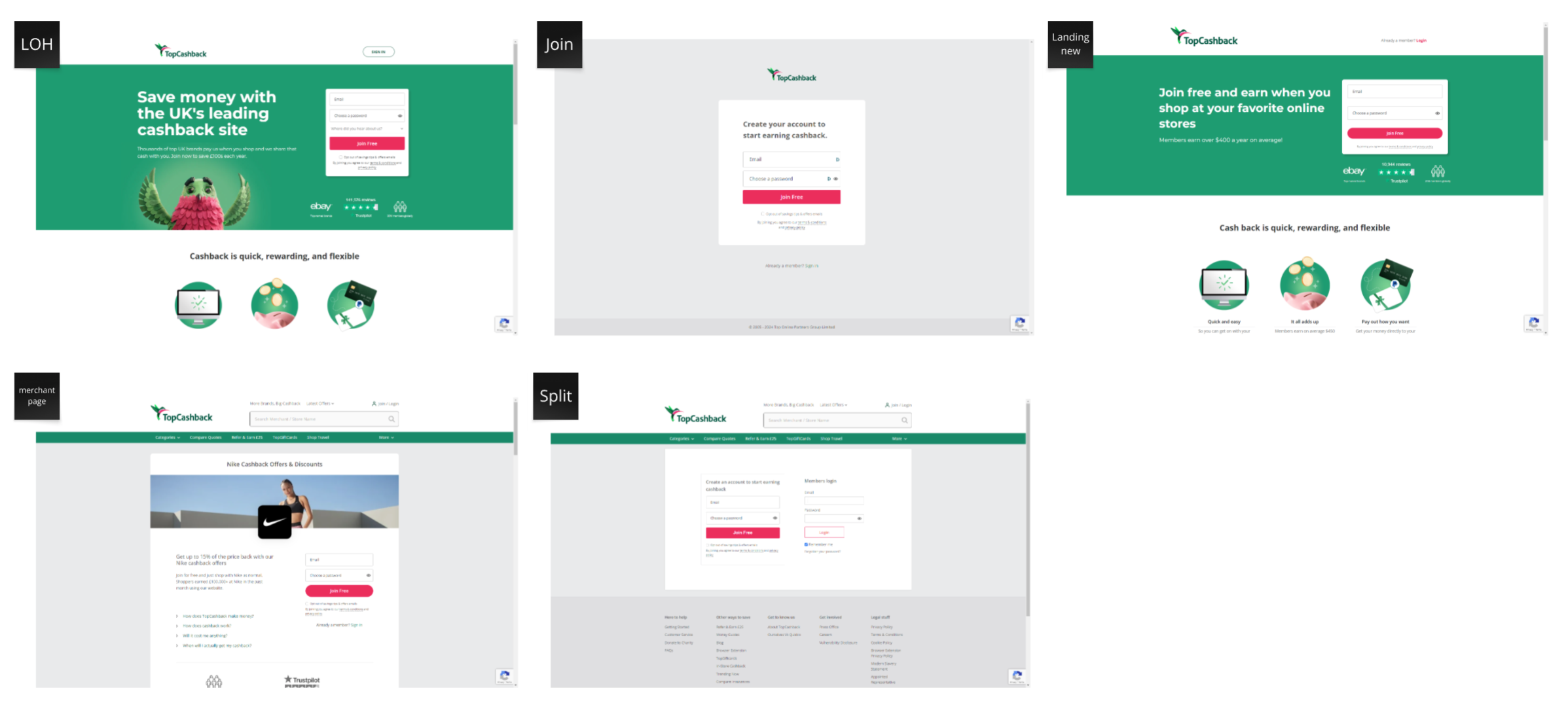
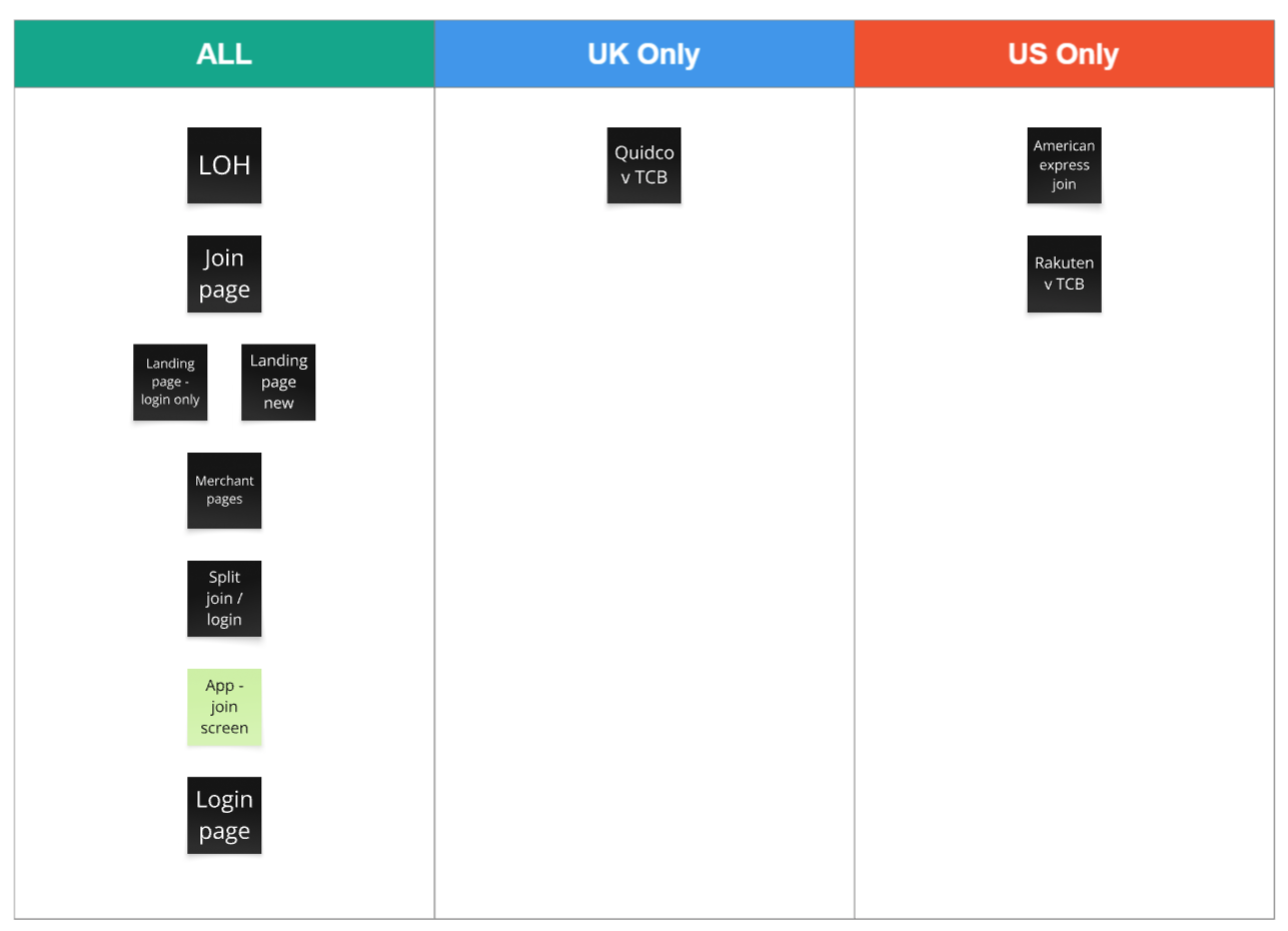
I began by mapping existing forms across the site and app, including identifying region-specific variations.
I then analysed how other companies implement SSO, focusing on their end-to-end journeys. While this flow appears simple, creating a seamless experience requires careful consideration. Some key observations:
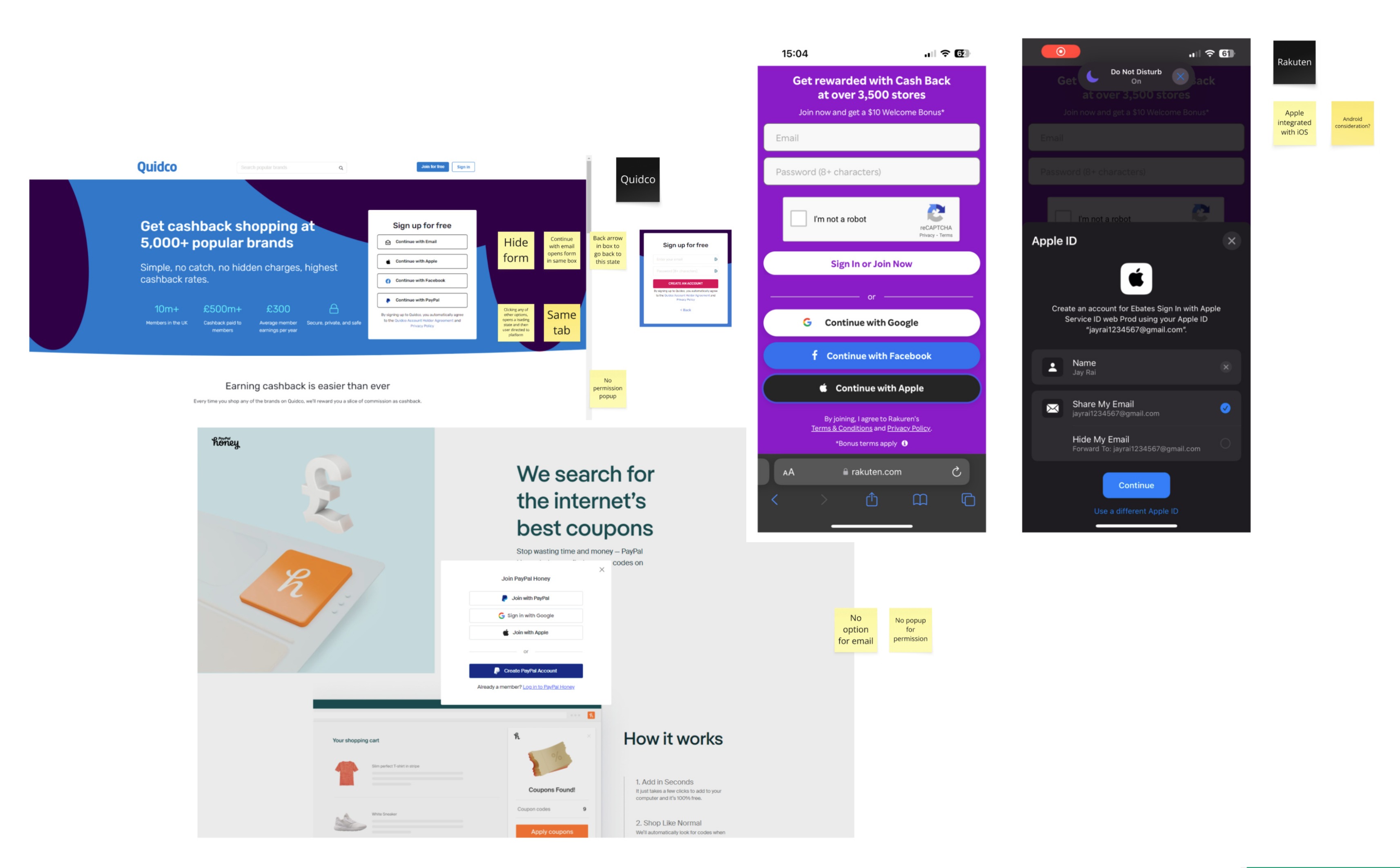
Two additional considerations became critical to the project:
The research highlighted four challenges that were particularly important for TopCashback:
For the first point, the agreed approach was account linking, allowing users to connect SSO providers to their existing accounts.
For the second, I proposed removing the form entirely and replacing it with clearer CTAs leading to a dedicated join page. While this introduced additional scope, it significantly improved the long-term UX.
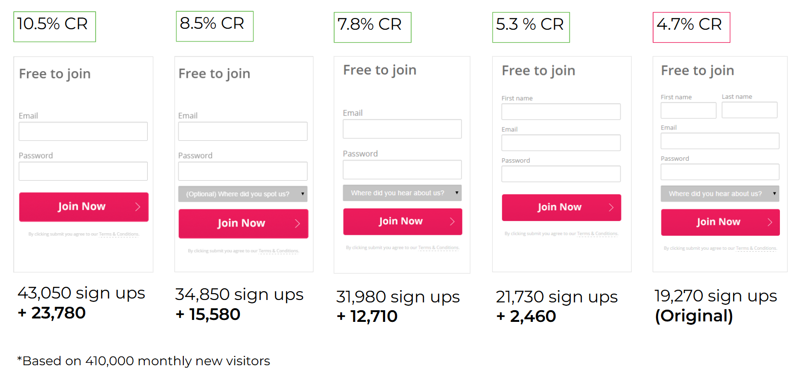
Using historic data that I found, I could prove that adding more options to the form was going to have a negative effect on conversions. Using this evidence, and competitor research, I was able to gain stakeholder alignment.
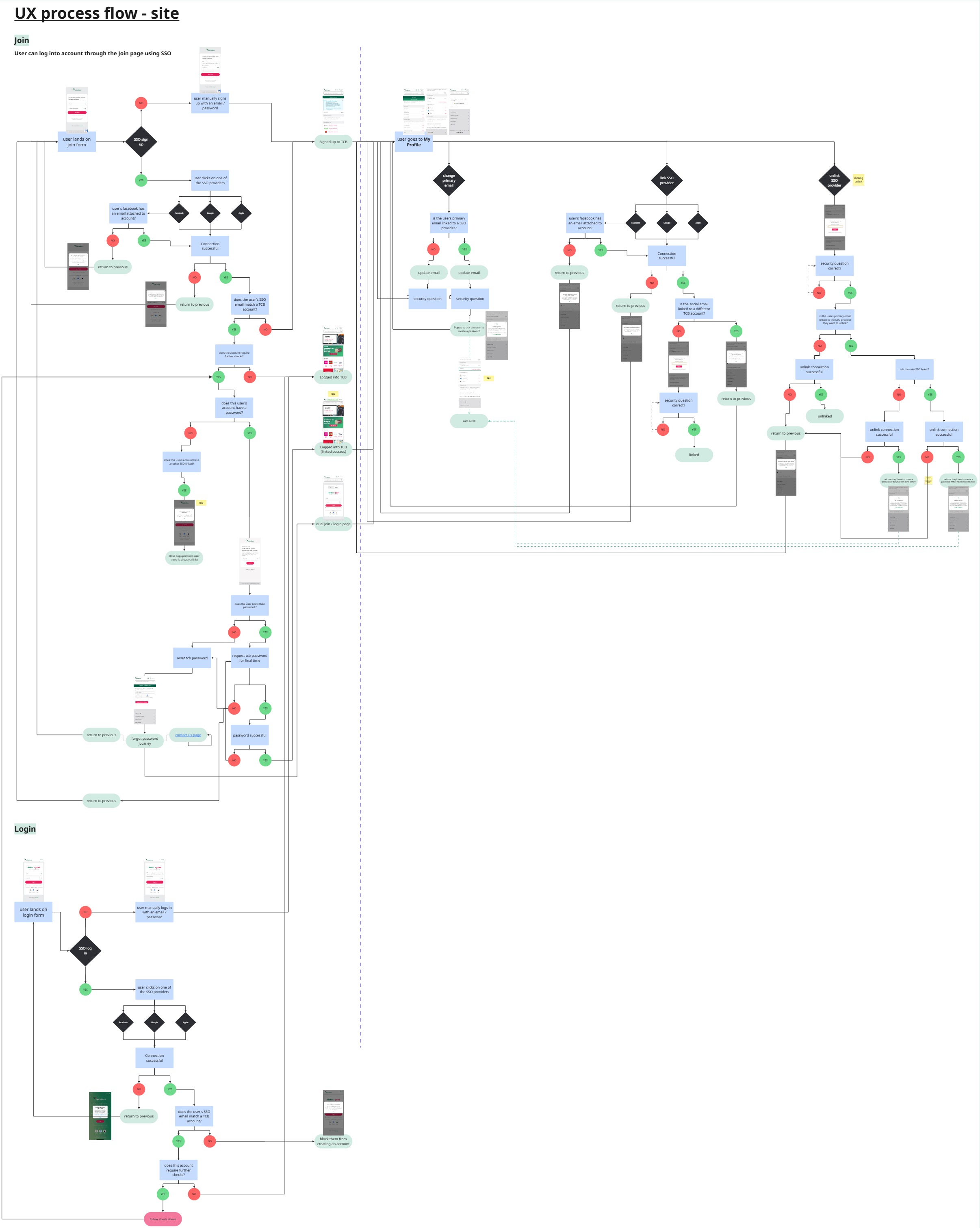
With alignment on direction, I developed detailed user flows for both web and app experiences. This was an iterative process that evolved throughout the project as new edge cases and technical constraints emerged. Some complexities included; platform-specific behaviours, edge cases triggered by different entry points, dependencies between journeys.
I refined these into clear, structured flows and worked closely with product managers and engineers to validate completeness and feasibility.
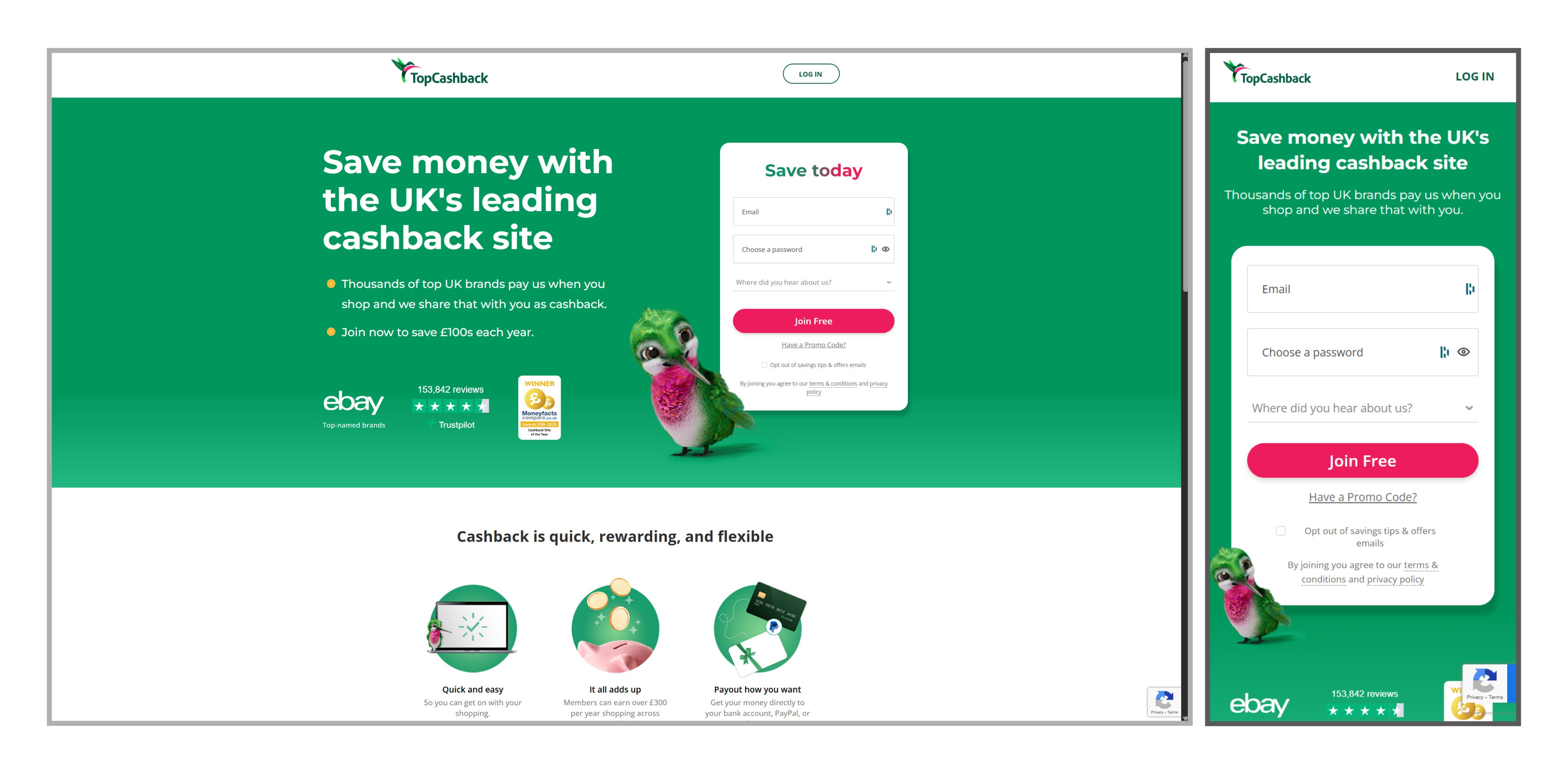
In parallel with development, I began redesigning the homepage. The goal was not to change the content, but to modernise the UI, strengthen brand presence, remove the sign-up form in favour of clearer, lower-friction entry points. As part of my process, I started with paper sketches to explore layout directions.
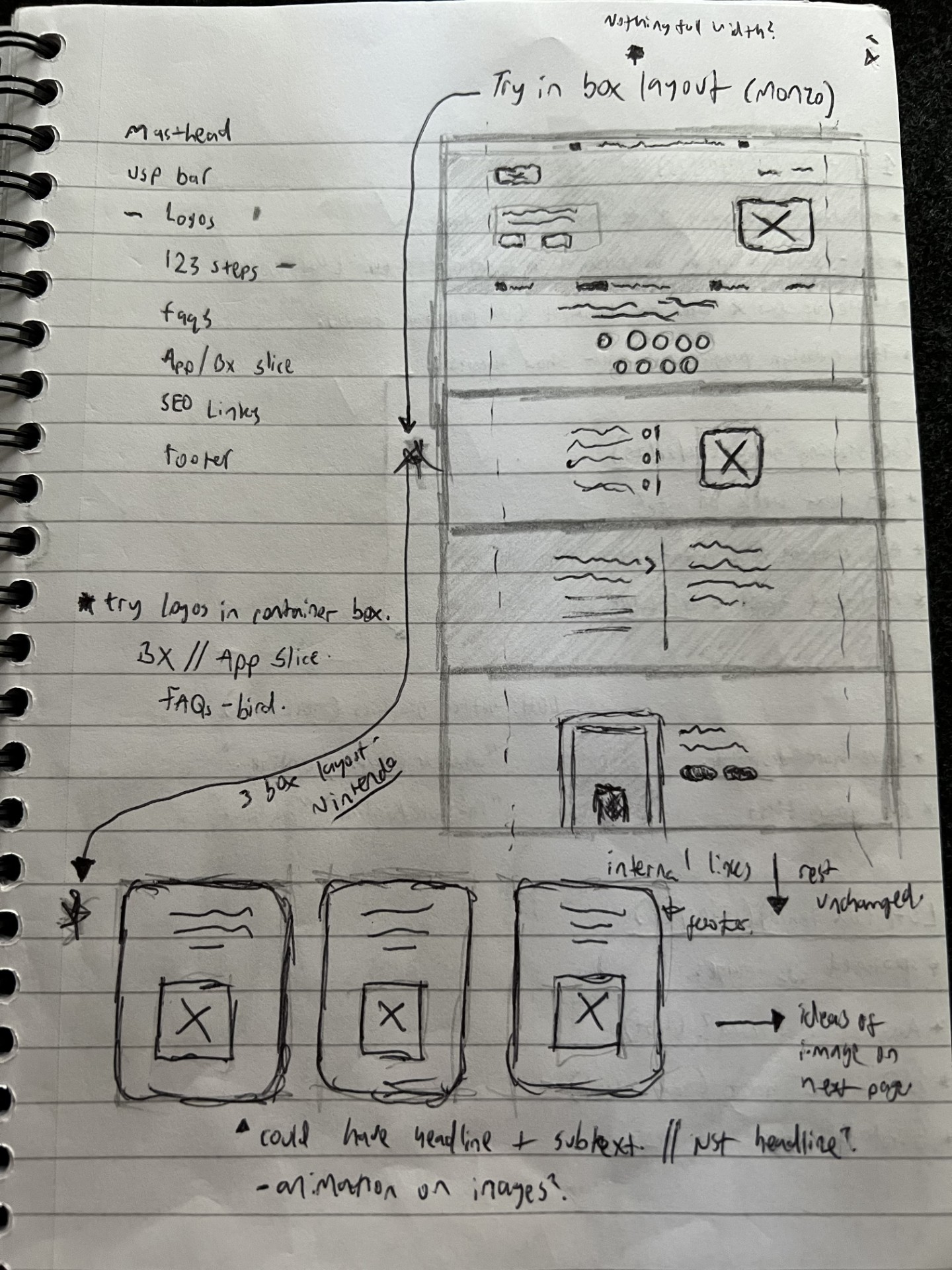
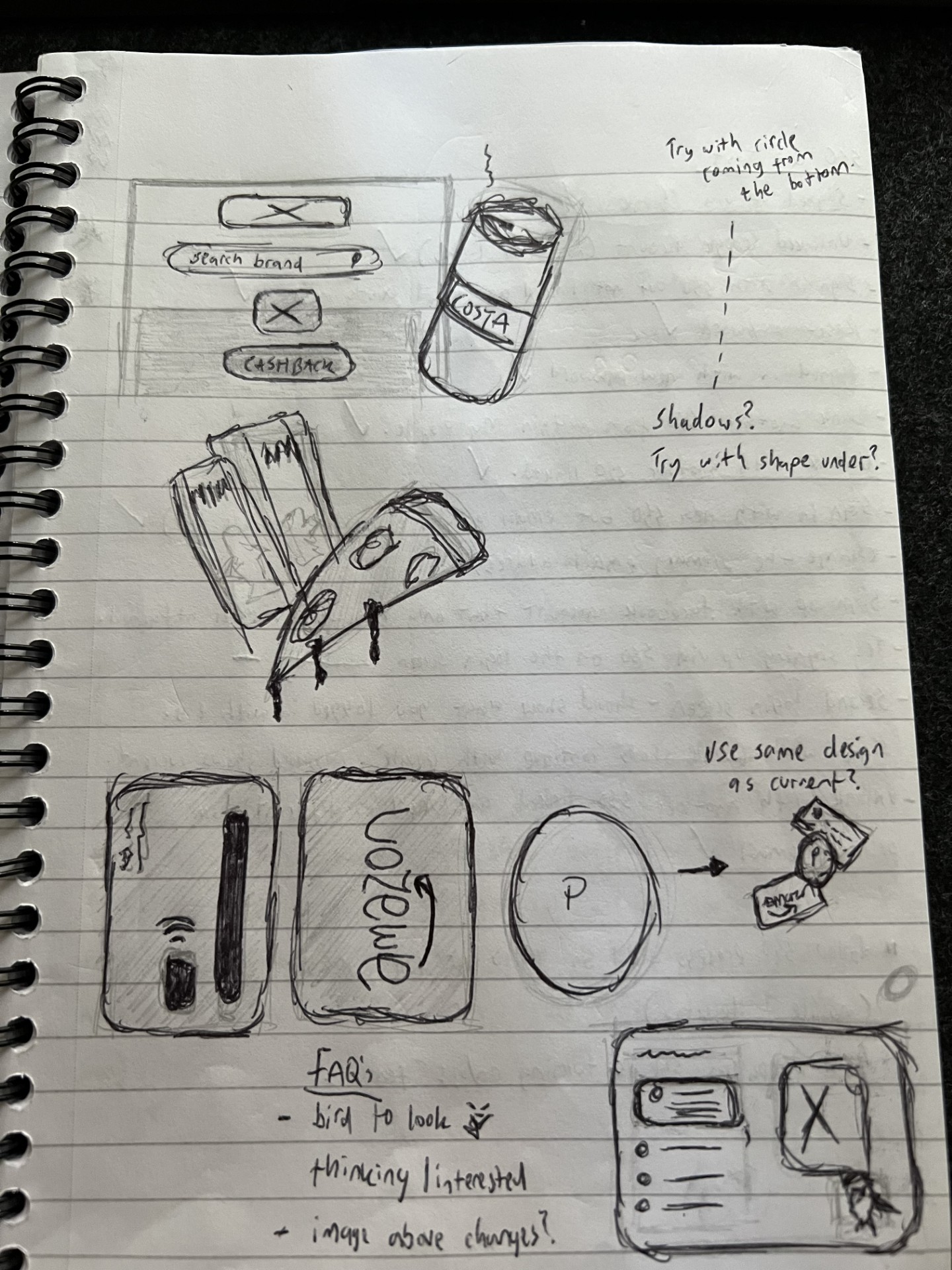
The top section (previously dominated by the form) required the most attention. I explored multiple layout variations that elevated the brand’s 3D bird asset, highlighted the core value proposition more clearly, retained key trust signals (e.g. Trustpilot, awards).
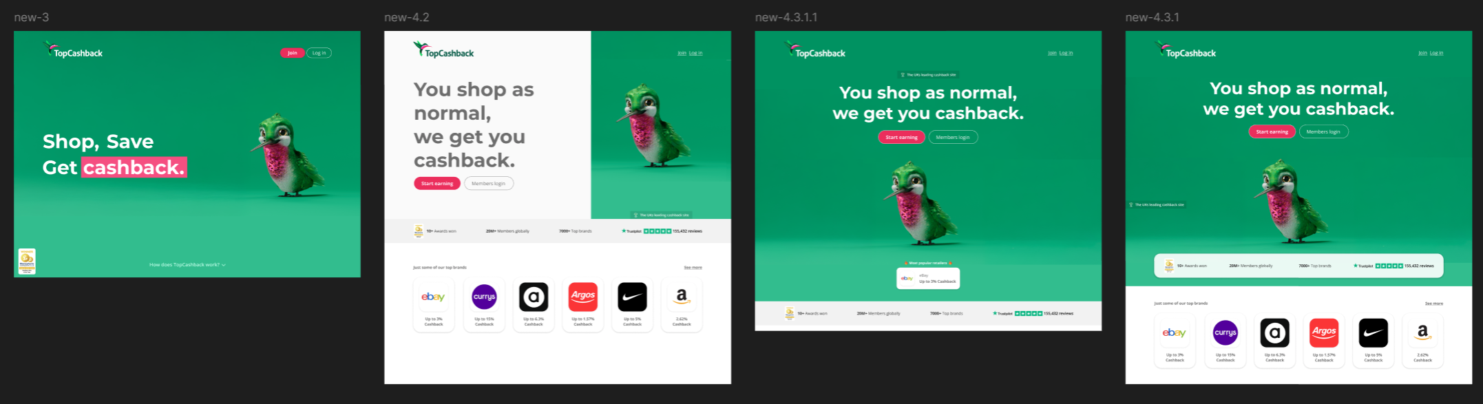
Initial feedback highlighted that removing the form created a feeling of “empty space.” Through iterations, I solved this by introducing engaging visual elements and subtle motion to maintain balance without cluttering the UI. The final solution addressed these concerns whilst improving the visual hierarchy.
After alignment, throughout the build, I continued collaborating with the development team to refine flows and resolve gaps that appeared.
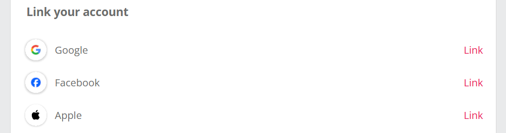
To ensure existing members could benefit from SSO, I designed the account linking journeys that allow users to link and unlink social providers within their account area. Within the user flows, I paid particular attention to edge cases such as, what happens when the user updates their account email/password or where a social account is already linked to another TopCashback account.
A new user does not want a form asking for personal details as the first thing they see on the homepage.
Simply adding SSO to the existing homepage form would have increased complexity and friction, especially with additional requirements such as terms acceptance and marketing preferences. Instead, the redesigned approach allowed the homepage to focus on communicating value before asking for any commitment.
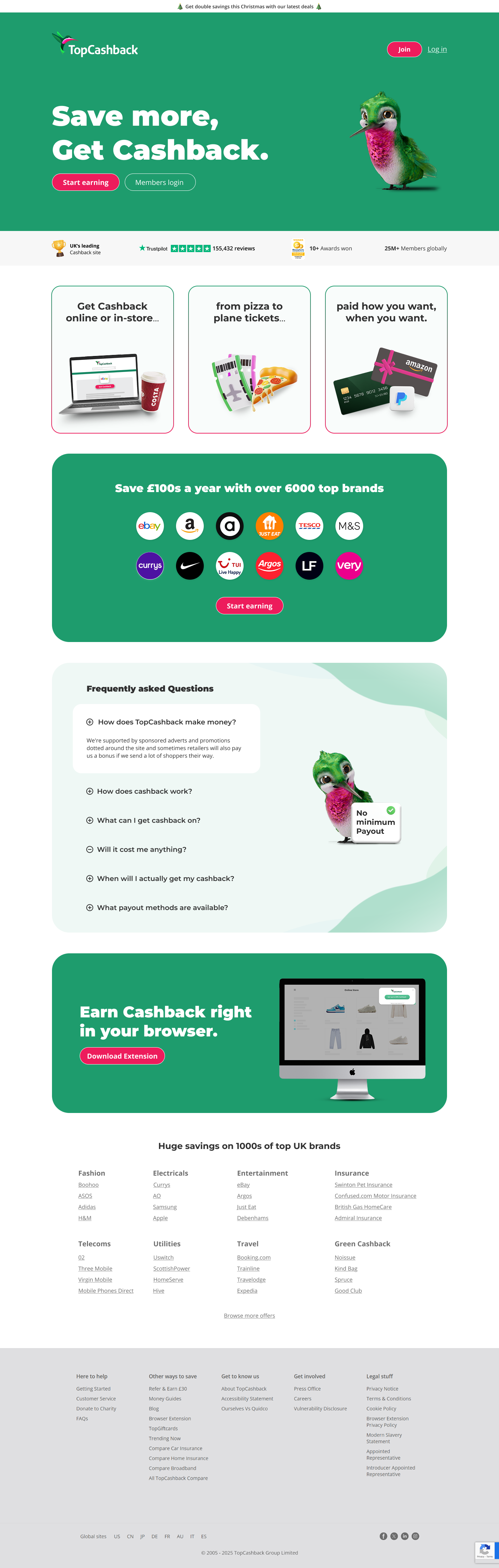
For the rest of the page, I adopted a more modern - bento-box style layout - with clear content sections to decrease cognitive load and allow the user to understand exactly what TopCashback does. Using Google Analytics, I identified that the majority of users accessed the site via mobile. Therefore, I adopted a mobile-first approach, ensuring layouts and components are scaled effectively across breakpoints.
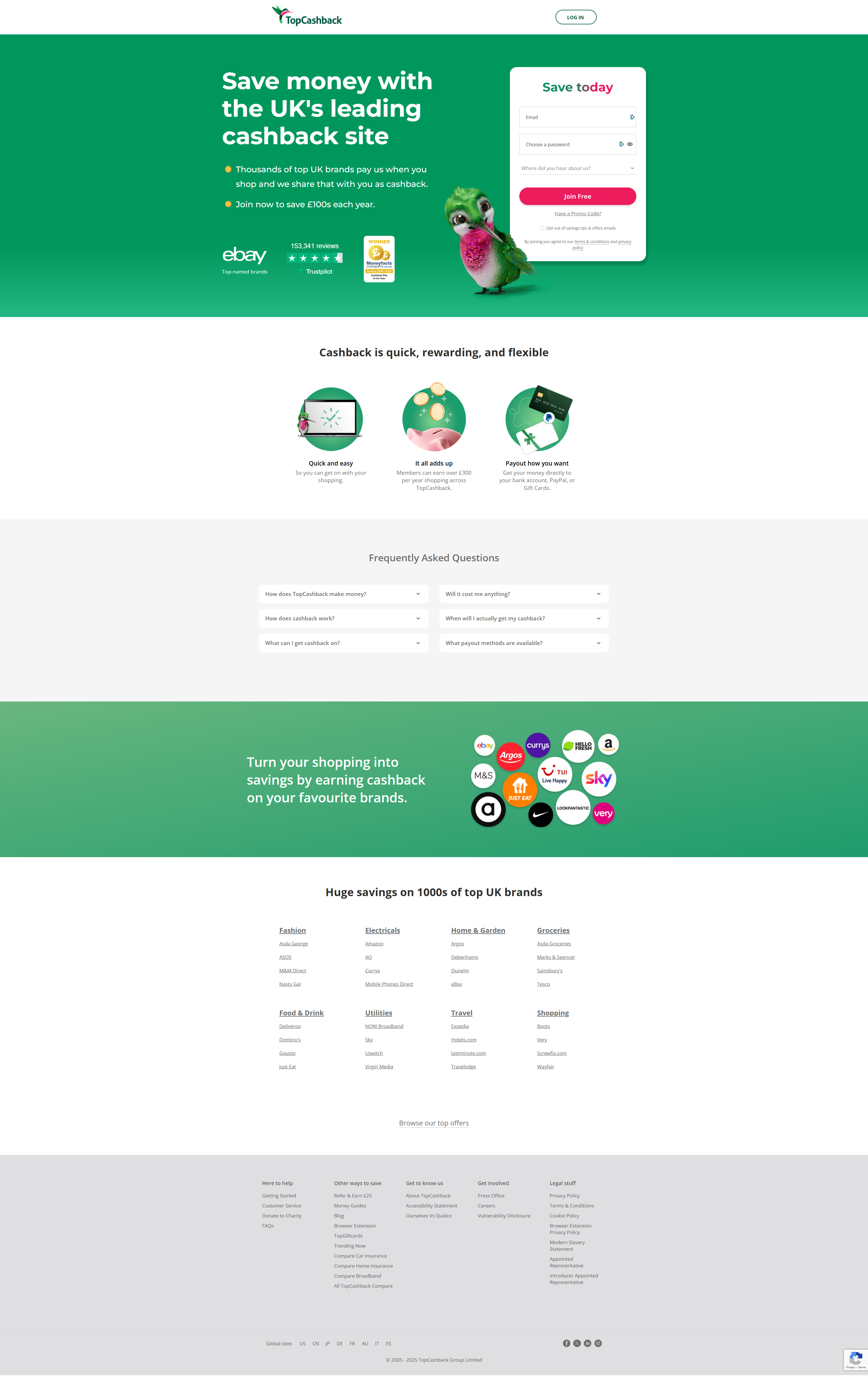
To ensure a cohesive experience, I also addressed the referral landing page - I retained a sign-up form due to the users intention on this page, but updated the UI to align with the new homepage. I introduced consistent elements to align with the new homepage and maintain continuity in the user journey.
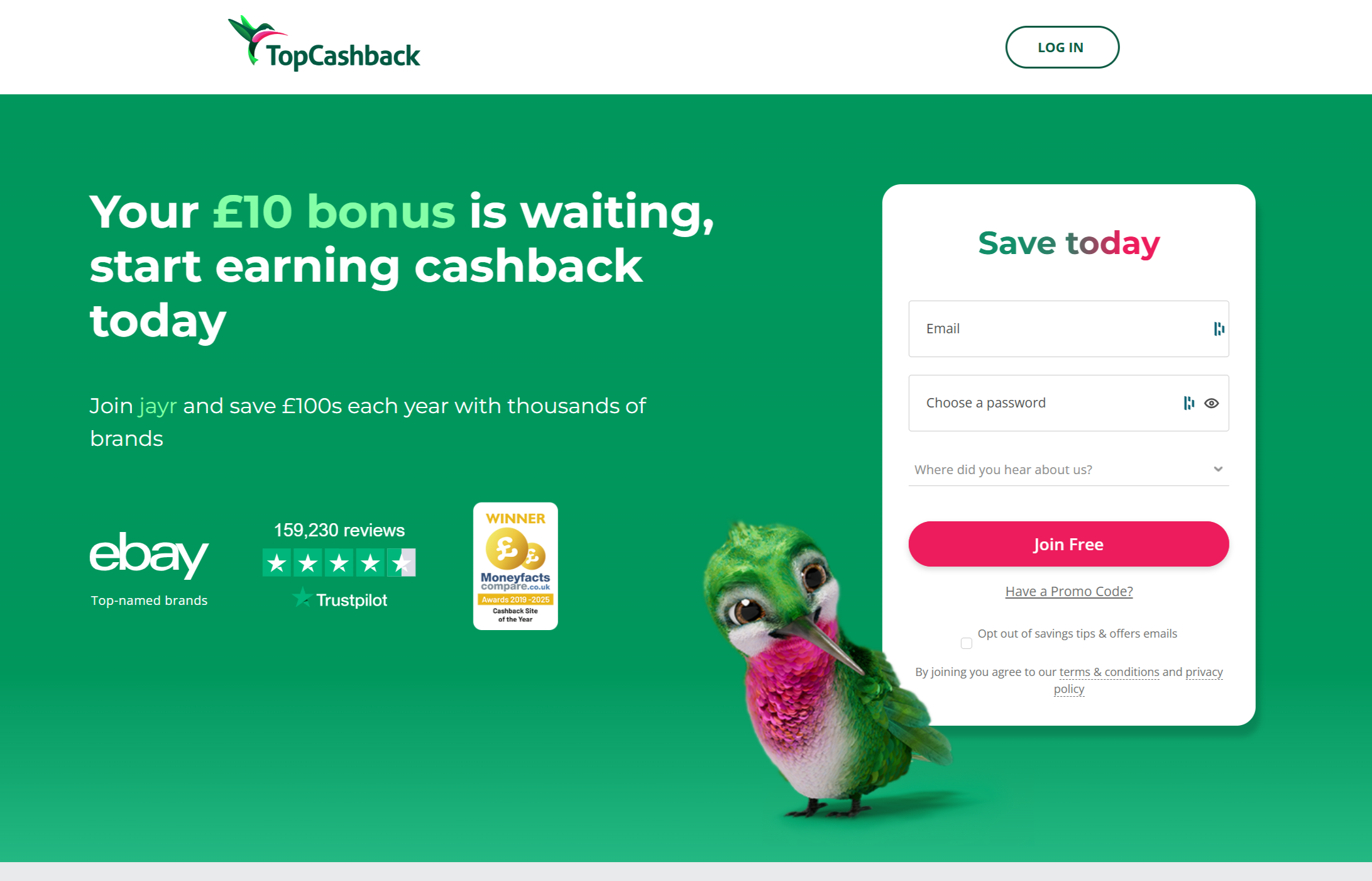
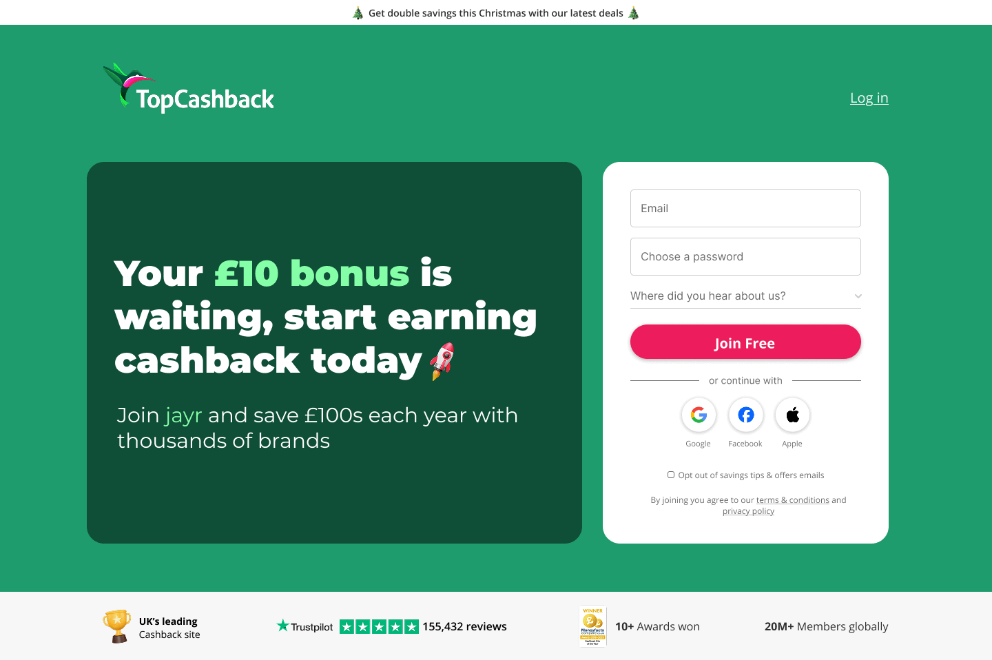
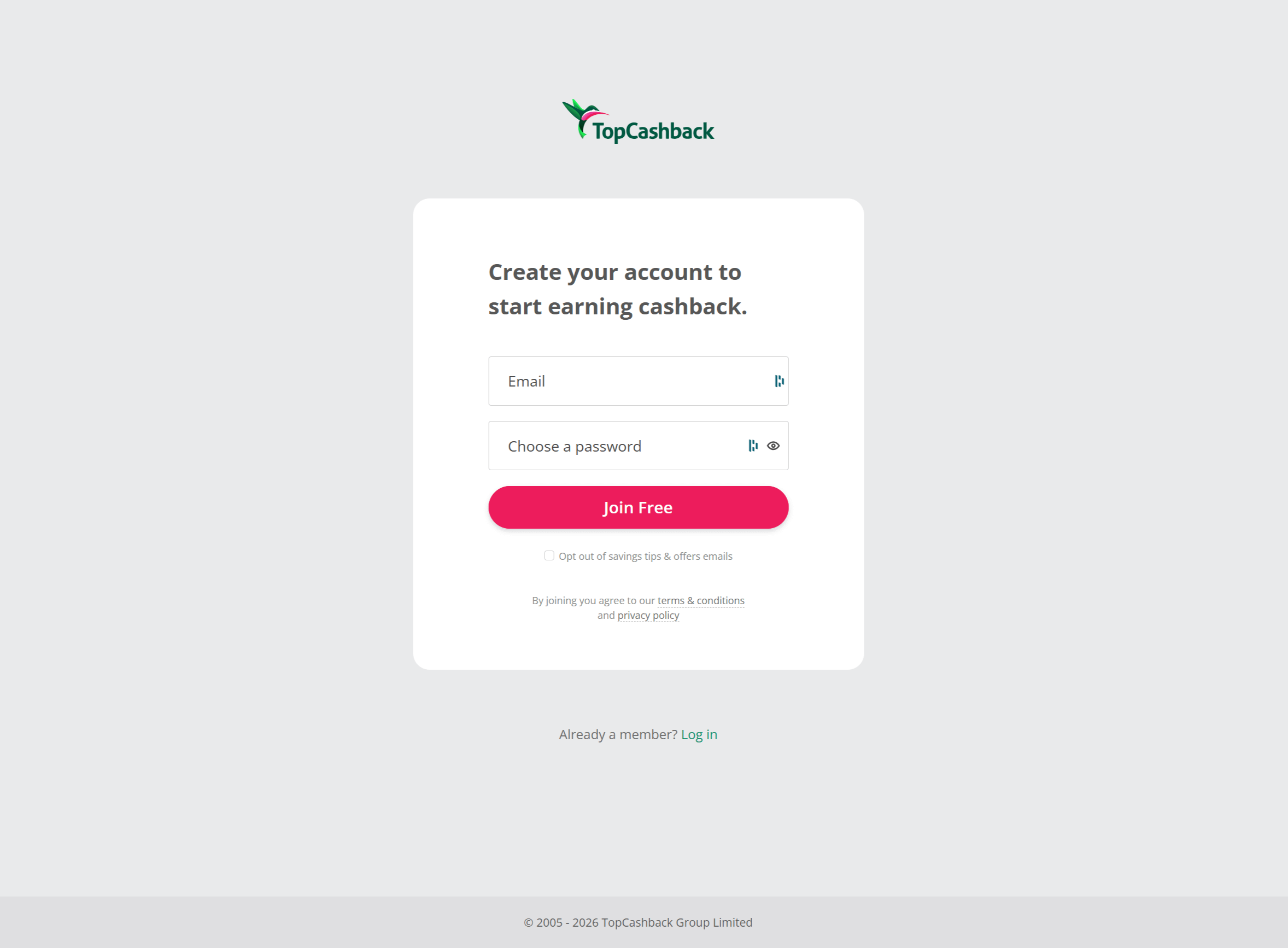
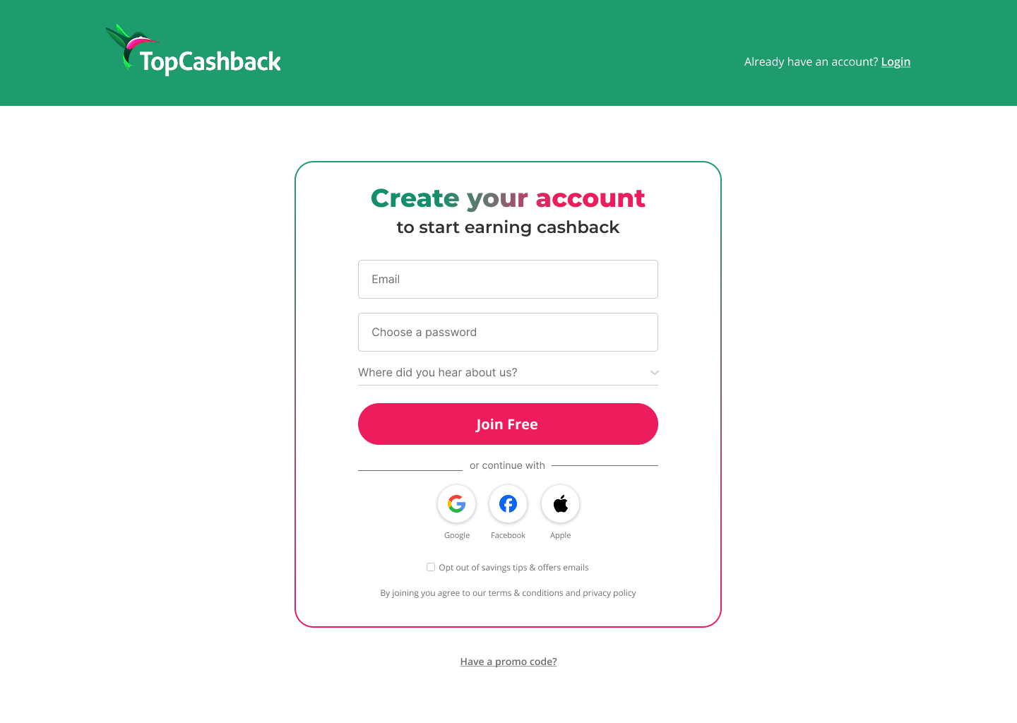
Working closely with the front-end developer, we ensured:
Delivering the project required collaboration well beyond the stakeholders. Alongside Product Managers and developers, I worked with Customer Services, Marketing, SEO and Engagement teams to validate journeys, understand considerations, and ensure the final solution balanced user experience with commercial goals. Throughout implementation, we regularly reviewed edge cases and technical constraints as new scenarios emerged.
I also coordinated with stakeholders across international markets (including the USA, Germany, France, Spain, Italy and Australia) to review the proposed journeys and identify any region-specific considerations before launch.
Presented the proposed SSO journey flows and homepage direction to UK and US Directors, using research, competitor analysis and prototypes to gain alignment on removing the logged-out homepage form before moving to implementation.
Through close collaboration across design, product, and engineering, we successfully launched SSO while simultaneously improving key entry points across the site. This project not only introduced a major new feature, but also enabled the modernisation of core user journeys, including the homepage, join page, and referral flows.
Within the first month, SSO accounted for 18% of total UK sign-ups and 26% of US sign-ups. Within that same period, 12,000 UK members and 33,000 US members linked an existing account to an SSO provider.