At a glance
- Company
- TopCashback
- Role
- Lead UX/UI Designer
- Duration
- Newsletter: 6–8 weeks
Welcome series: ongoing - Platform
- Tools
- Figma, Miro, Adobe Suite, HTML/CSS, Analytics, Qlik
This study contains 2 email projects focused on different stages of the member journey. One to improve early retention through the welcome email series, and the other a full redesign of the UK newsletter to increase engagement without compromising commercial performance.
Emails are one of TopCashback's most valuable engagement channels, this case study covers two separate projects, a redesign of the UK newsletter in 2024/25 and an ongoing redesign of the UK welcome email series in 2026.
These projects addressed different product problems. The newsletter redesign focused on improving engagement and modernisation whilst maintaining revenue through retailer placements. The welcome email series project focused on the first two months of signing up - where a proportion of new members fail to return after their first transaction.
I led the UX/UI design work across both email projects, along with another UX/UI Designer and working closely with the Email teams from discovery through to final solution.
Both projects aimed to improve engagement without treating the emails as a purely visual design improvement. The welcome email journey needed to encourage repeat behaviour at a point where many members might be disengaged, whilst the newsletter needed to feel more distinctive without reducing commercial goals.
The Email team approached us after identifying a significant drop in member engagement during the first two months. While around 25–30% of new members complete a transaction within their first month, almost 70% of those members do not return to make a second transaction the following month. More significantly, 85% of members who do not return within that period never transact again.
Could the welcome journey encourage repeat behaviour and improve long-term member engagement?
Rather than simply redesigning individual emails, we reviewed both the content and timing of communications to ensure members received the right message at the right time.
The Email team had already tested communications aimed at members predicted to lapse. One email, designed to explain what happens after a first purchase, achieved an 8% Email Conversion Rate. Although this provided useful behavioural insight, our objective was to intervene earlier in the onboarding journey.
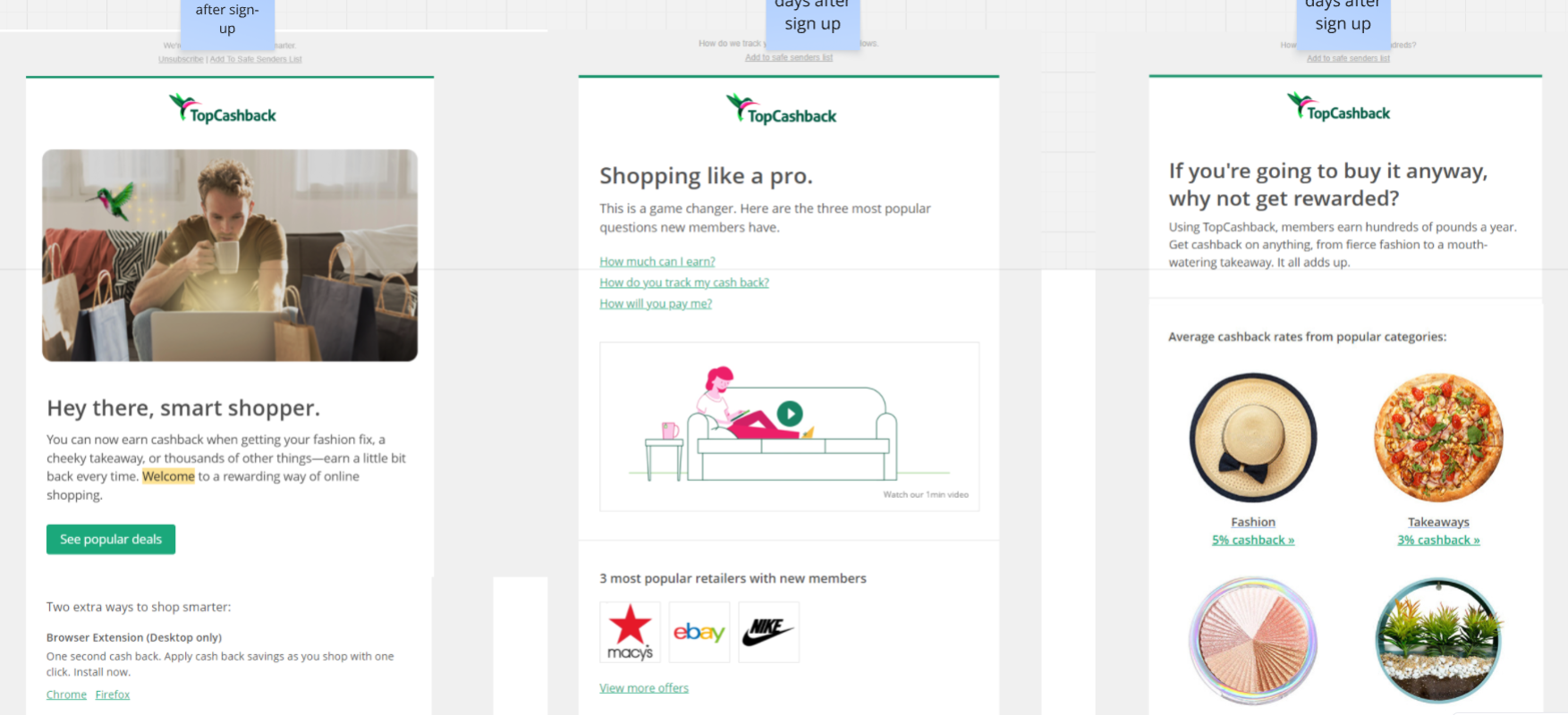
Before proposing any changes to the emails, I mapped the complete welcome email journey to understand every communication a new member could receive, and how the messages related to one another. This helped identify whether members were receiving too many emails or missing useful communication at important stages.
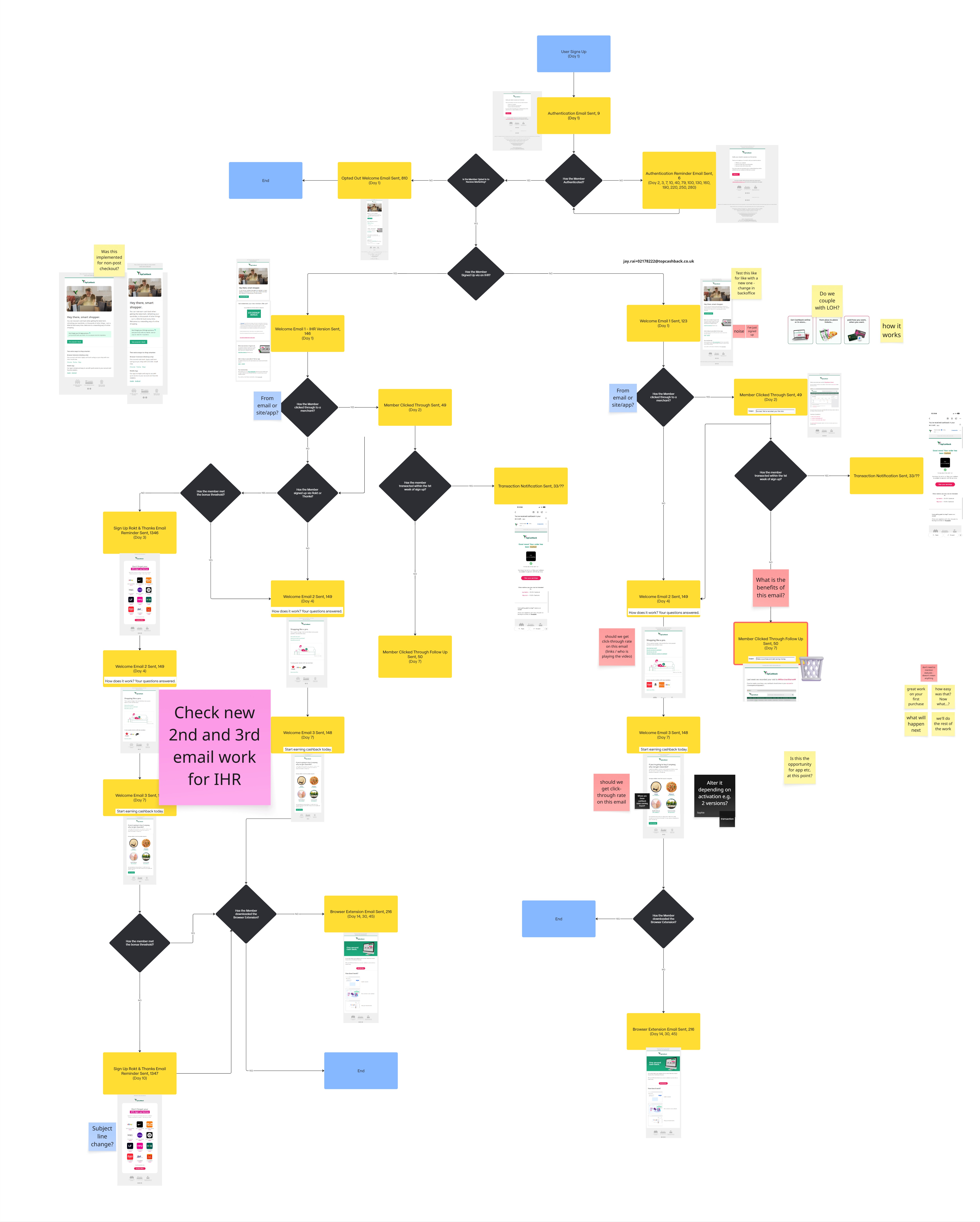
Visualising the journey highlighted several recurring issues:
Rather than treating every new member the same, the journey needed to respond to where they were in their cashback journey.
I explored a behaviour-led structure in the email flow, where communication changed according to member actions. This revised email journey focused on improving both relevance and timing.
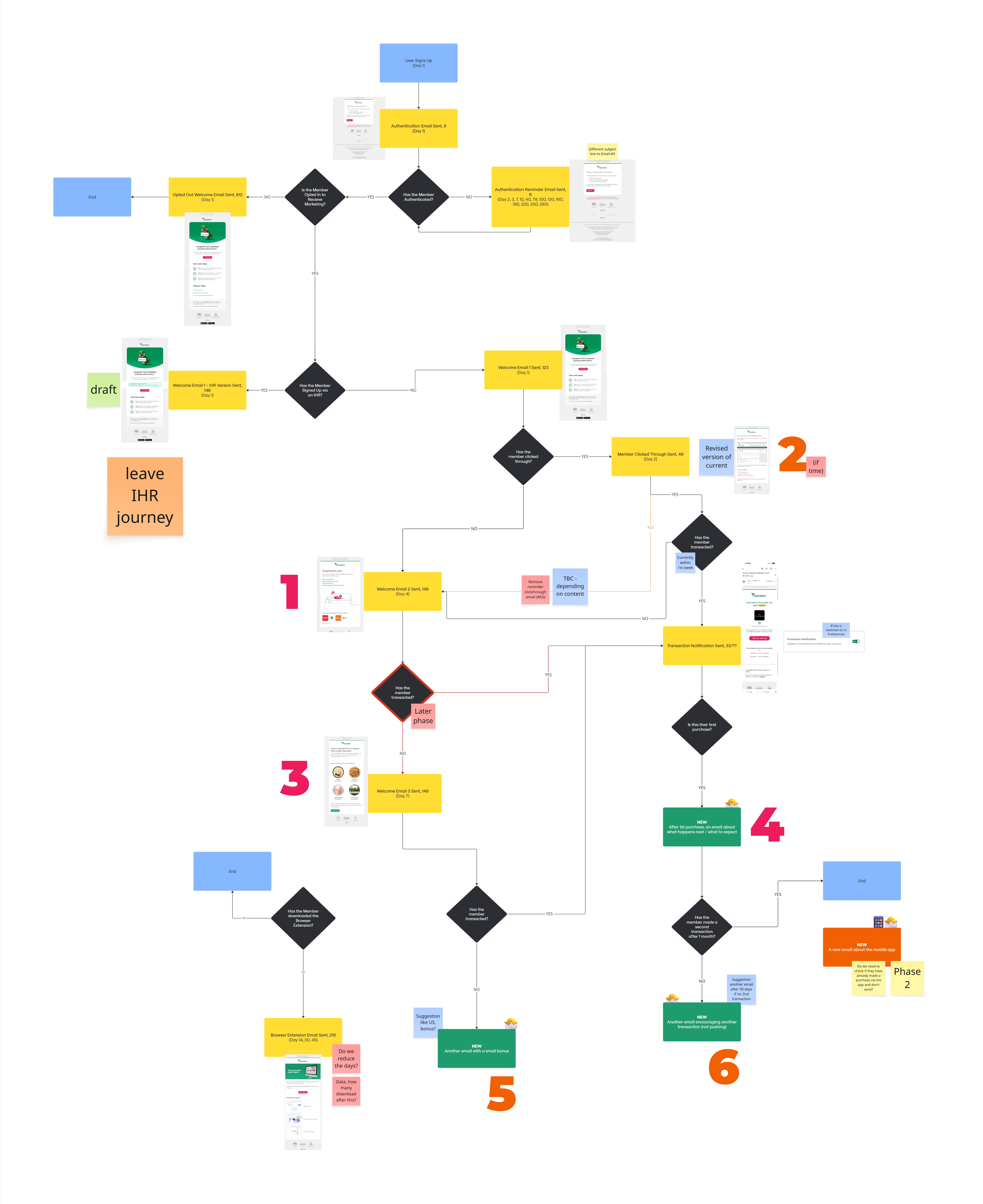
Members who completed a first transaction would receive different communications from those who had not yet transacted, whilst members who had not returned after their first purchase would enter a different path.
This shifted the welcome email series away from a schedule, and towards a more contextual and driven by member behaviour experience.
The welcome email series project is currently in progress. Designs will be added once the work has launched.🚀
The Email team approached us to improve the UK newsletters sent several times each week to opted-in members. The newsletters reach a large audience and generate significant revenue through member activity and paid retailer placements, so the challenge was to modernise the experience and improve interactions without compromising commercial performance.
Working with the Email team, I used a MoSCoW framework to define what the newsletter needed to achieve:
I analysed the existing newsletters and their performance:
The redesign needed to balance user needs, technical constraints, and commercial performance - not just introduce a more modern UI!

Reviewing the existing newsletters revealed several issues. Although newsletters were sent three times each week, they were visually almost identical, making each send feel repetitive despite containing different content.
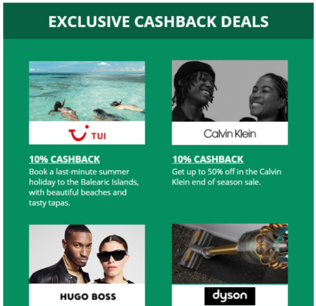
The retailers were displayed in a long uninterrupted list, which is exaggerated on mobile devices - where, as mentioned, most members view the email. Internal promotions lacked a consistent visual style and often resembled a third-party advertisement rather than part of TopCashback.
These observations highlighted opportunities to improve hierarchy, to create clearer visual separations, and make each newsletter feel more distinct.
The redesign focused on increasing engagement while preserving the commercial flexibility.
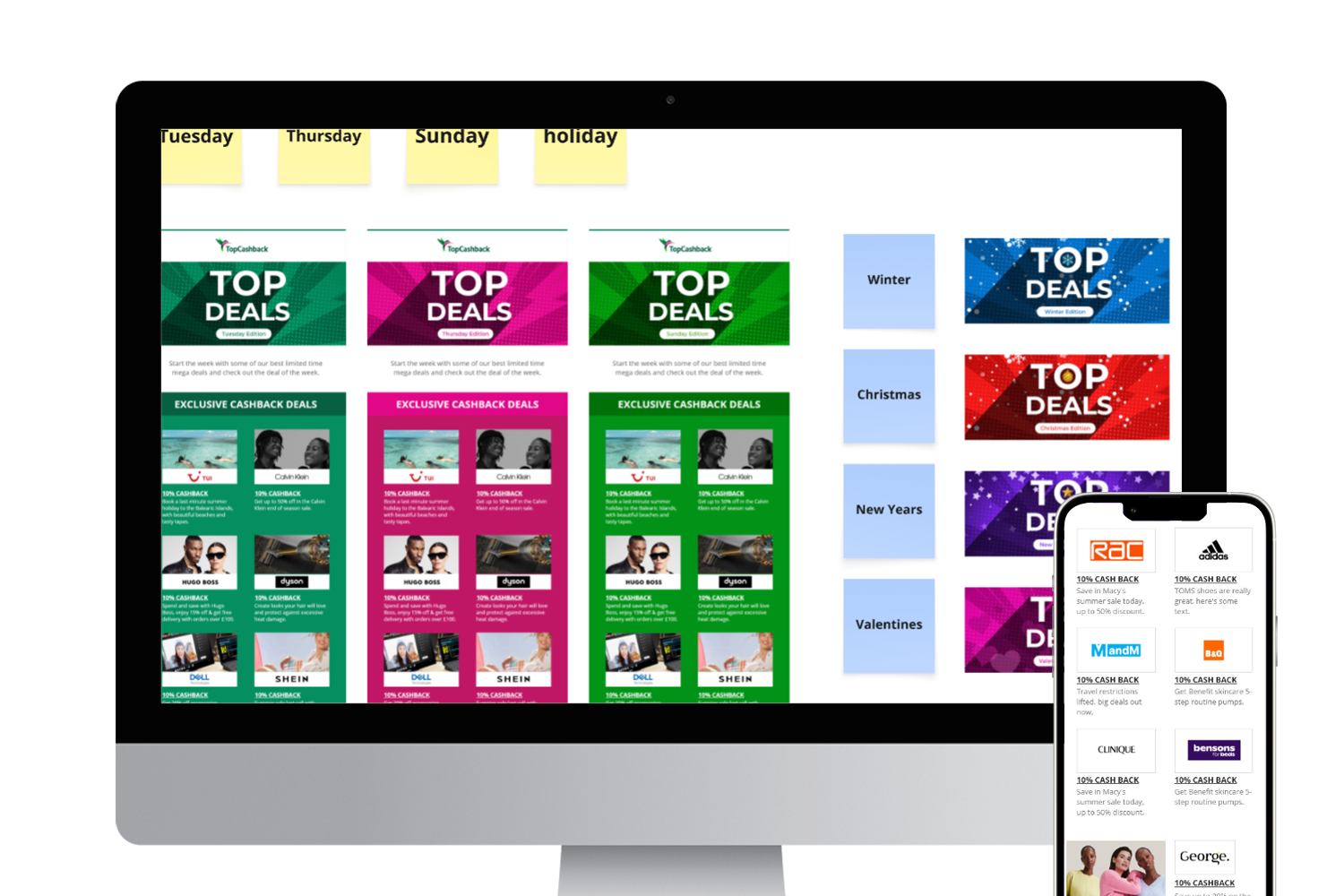
I introduced distinct visual themes for each newsletter day. Using different colour palettes - in the top sections - while remaining recognisably TopCashback helped reduce the feeling of receiving the same email multiple times each week.

Premium placements were also given greater prominence through an improved visual layout helping reinforce their value - to the user and the retailer.
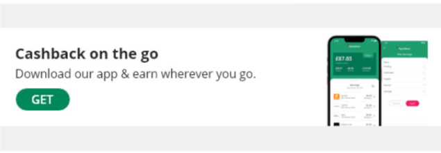
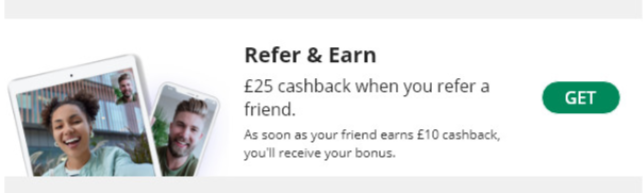
Internal product promotions were redesigned into a consistent component, making them feel like a natural extension of the newsletter rather than a third-party advertisement. At the same time, these inserts/component remained simple for the Email team to update without requiring design support.
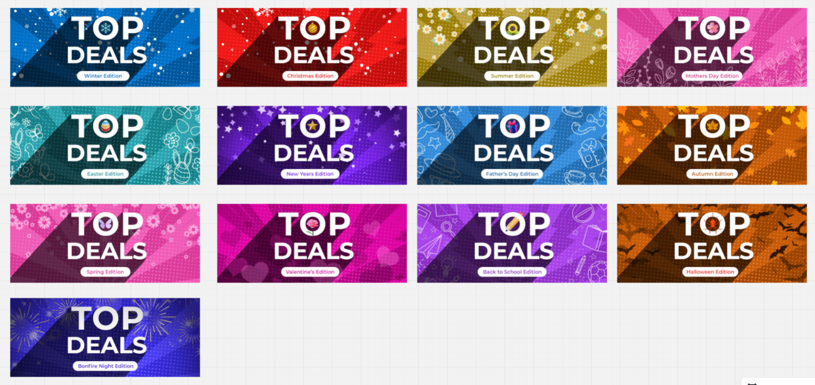
To keep newsletters feeling fresh throughout the year, I also designed a series of seasonal headers for key events such as Back to School and major holidays. We deliberately reserved them for moments where they would feel meaningful and retain their impact.
Both projects required close collaboration with the Email team. Together, we reviewed performance data, content, send timing, retailer requirements and all the user journey paths, whilst considering constraints of building and maintaining the emails.
For the newsletter, regular alignment helped ensure the design could accommodate at least 38 placements, preserve revenue opportunities and remain within Gmail's HTML size limit.
The Newsletter redesign introduced a more engaging and flexible email whilst retaining the commercial capacity required by TopCashback. The current reported results include a 27% increase year-on-year in average total clicks, and a 56% increase in engagement rate. Within the first few weeks following launch, the average total clicks saw a 48% increase.
The Welcome email series project is still in progress, so post-launch performance data is not yet available.