TopCashback App
Various app work for TopCashback.
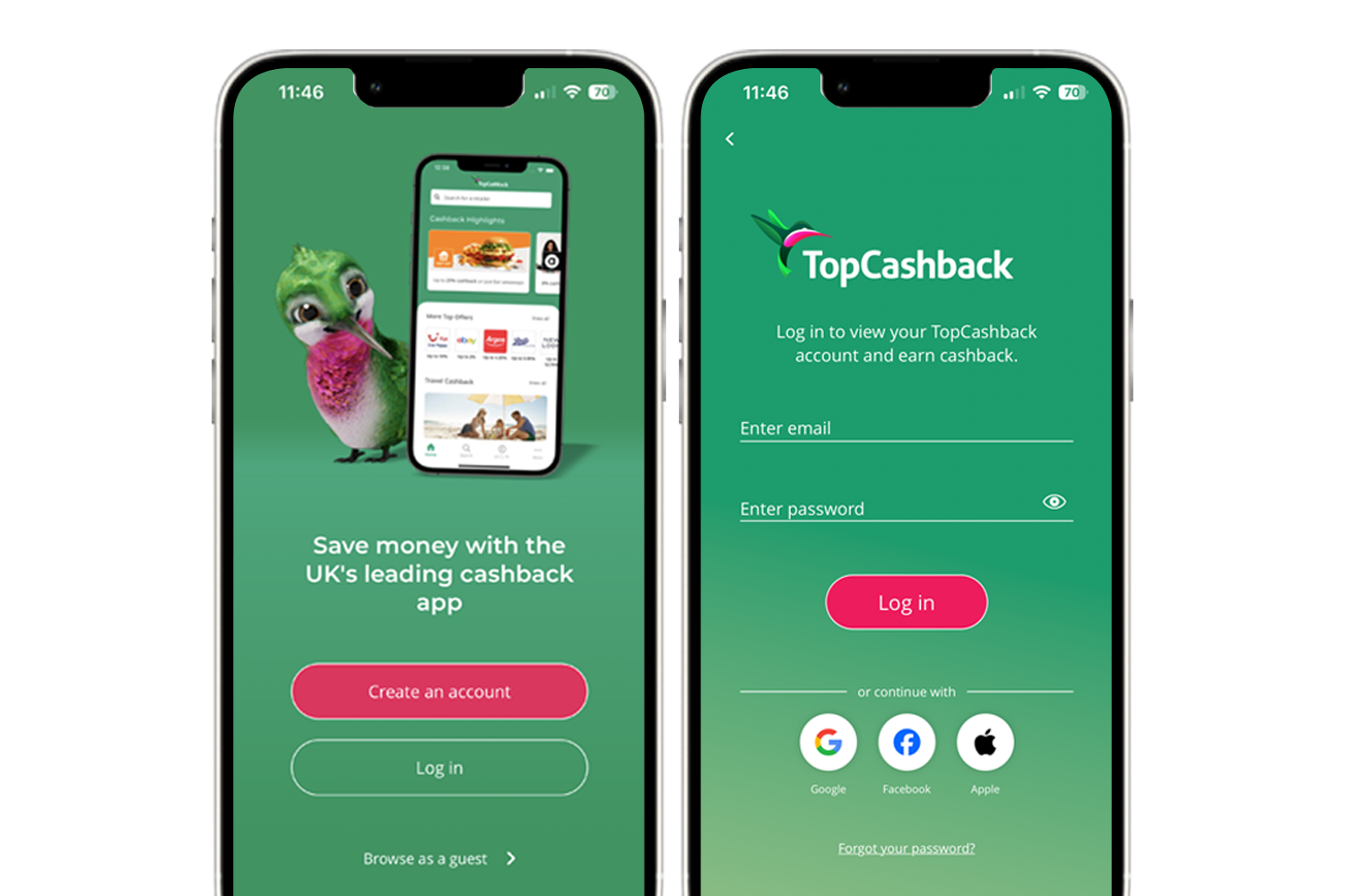
For every project I work on, I consider the impact across both web and app experiences. With millions of members using the TopCashback app as their primary platform - particularly in the UK - it's important that users receive the same attention to detail regardless of where they interact with the product.
Following design guidelines closely, and using best practices from Apple Human Interface Guidelines and Android Material Design, I ensure experiences feel native, intuitive, and consistent with user expectations.
I work closely with app developers across multiple platforms to ensure designs are implemented correctly (with help of Zeplin) and make the best use of native components, as well as introducing innovative ideas that increase usability and user delight i.e. making interactions fun but also confirmational.
 View full size ↗
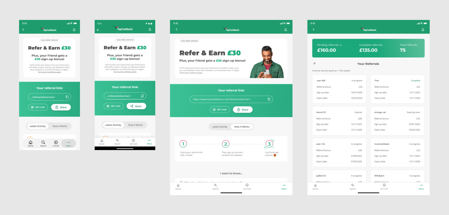
Refer & Earn
A mockup of the referral page on the app for both iOS & Android, and mobile & tablet. This was a large redesign of our highest acquistion channel. View more details of this project.
 View full size ↗
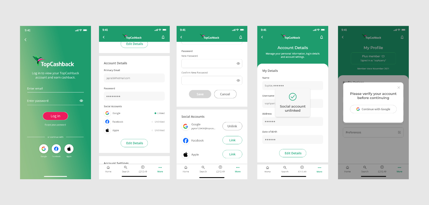
SSO
Implementing SSO onto the app concurrently with the site, this included designs for all the forms as well as the ability for the user to link/unlink accounts. View full journeys/designs.
iOS Browser Extension
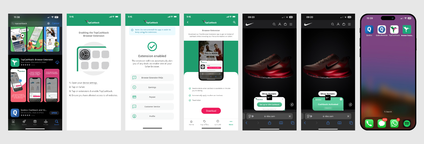
I led the design for the launch of TopCashback’s first iOS browser extension, which was a relatively new capability within Apple's iOS at the time. Alongside the extension itself, I designed a dedicated companion app that guides users through installation and setup.
As the app's primary purpose was to help users install and enable the extension, I intentionally kept the experience simple and instructional, using clear visual guidance to minimise friction during onboarding. I also worked on how the extension was marketed within the main TopCashback app, creating opportunities to educate members and encourage adoption.
A key consideration was differentiating this new app from the main TopCashback app. This included ensuring a distinct visual identity on the App Store to avoid confusion while still maintaining a clear connection to the brand.
The extension itself was later redesigned in parallel with the desktop extension, allowing us to introduce new functionality while aligning both experiences under a more modern and consistent UI.